
深入讲解如何使用 JavaScript 结合现代 CSS 实现高性能的相册缩略图网格布局与响应式适配,包含动态列宽计算、ResizeObserver 监听、requestAnimationFrame 防抖调度与零 CLS 优化实战。

当前位置:首页 > JavaScript 项目实战 > 正文
JavaScript实现相册缩略图网格布局与响应式适配
作者:极速慢跑
时间:2026-11-18
浏览:609
文章目录
前端工程实践
阅读时长约 8 分钟
技术栈:原生 JavaScript / CSS Grid / ResizeObserver
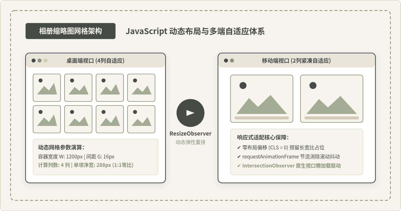
缩略图概览:基于 JavaScript 与 CSS 变量联动的响应式相册缩略图自适应体系
实现一套体验流畅的相册缩略图网格,核心目标是在各种屏幕与容器尺寸下,动态计算最佳列数与单元格几何尺寸,并在保证等比例裁剪的同时杜绝因图片异步加载或视口微变引起的页面布局偏移(CLS)。本文将通过数学建模、ResizeObserver 容器感知、requestAnimationFrame 节流及 CSS 自定义属性联动,从零构建一套高可靠、高性能的原生 JavaScript 响应式相册网格。
一、认知辨析:纯 CSS Grid 能够完全取代 JavaScript 吗?
在讨论 JavaScript 实现之前,很多前端开发者会提出疑问:“现代 CSS 已经支持 grid-template-columns: repeat(auto-fill, minmax(200px, 1fr)),难道纯 CSS 还不够解决网格自适应吗?”
这种说法在展示内容简单、不需要深度交互的标准卡片流中确实成立。CSS auto-fill 具备零运行时开销的巨大优势,但在实际生产级相册业务中,仅靠纯 CSS 往往会遇到以下四个关键瓶颈:
- 父级容器动态形变感知缺失:很多相册并不独占整个浏览器窗口,而是放置在可折叠侧边栏、可缩放面板或弹窗内。纯媒体查询(Media Queries)只能监听全局
window的尺寸,无法感知局部宿主容器的真实宽度变化。 - 列数阈值与剩余像素无法精细控制:CSS 的
1fr会在列数切换瞬间产生非线性的宽度膨胀。当容器宽度刚好多出几个像素时,可能会出现单张图片在特定断点突增 50% 宽度的视觉突兀感。 - 长列表与虚拟滚动(Virtual Scroll)联动受阻:对于数千张相片的大型相册,通常需要虚拟列表只渲染可视区域的 DOM 节点。虚拟滚动引擎必须在 JavaScript 内存中预先获知每一行的高度、当前每行精确容纳的列数以及每一个项目的精确坐标,纯 CSS 的排布结果无法直接反哺给调度算法。
- 图片长宽比与占位骨架屏的动态同步:在相册支持自由切换“正方形裁剪(1:1)”、“横版拍立得(4:3)”或“原图比例”等视图时,纯 CSS 很难做到统一计算与无缝过渡。
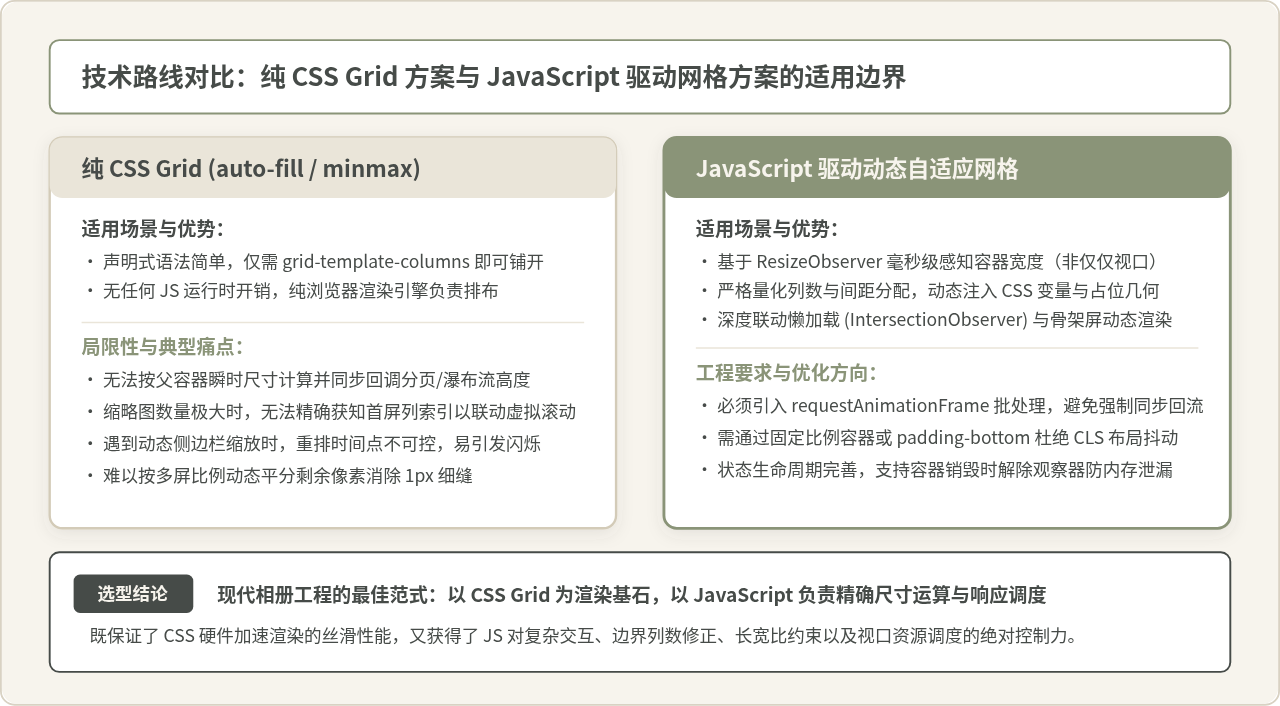
图 1:纯 CSS Grid 方案与 JavaScript 驱动网格方案的能力对比与适用边界
因此,现代相册网格的最佳实践是“CSS 负责排版执行,JavaScript 负责中枢决策”:由 JavaScript 负责监听容器、推导最优列数、计算精确尺寸并通过 CSS 变量注入,再由浏览器底层高效完成像素级硬件加速渲染。
二、核心原理与数学计算模型
网格排布的核心在于:在给定的容器宽度 containerWidth 下,依据开发者设定的“最小单元格宽度” minItemWidth 与“格栅间距” gap,精确解出当前应该呈现的整数列数 columns,进而推导出每一列的实际像素宽度 itemWidth。
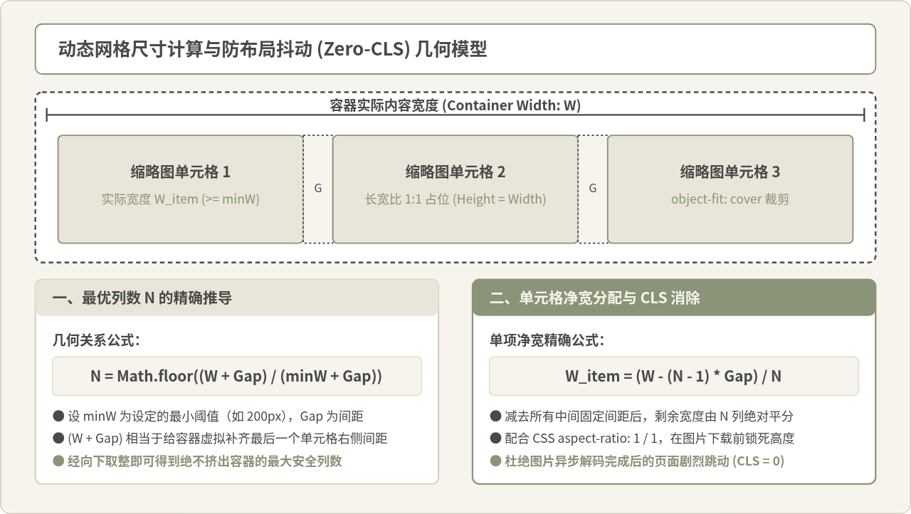
图 2:动态网格尺寸计算与防布局抖动 (CLS) 几何推导模型
1. 最优列数推导公式
假设容器内部净宽度为 W,设定的单元格间隙为 G,期望的单元格最小允许宽度为 W_min。一共有 N 列缩略图时,总共会产生 N - 1 个间隙。因此整个网格所占的总宽度应满足:
总宽度 = N * W_item + (N - 1) * G <= W为求出容器所能容纳的最大整数列数 N,我们将两边同时补齐一个间隙 G:
N * (W_item + G) <= W + G
=> N <= (W + G) / (W_item + G)
由于要求 W_item >= W_min,因此最优安全列数 N 可以通过向下取整获得:
const columns = Math.max(minColumns, Math.min(maxColumns, Math.floor((width + gap) / (minItemWidth + gap))));在此基础上,通过 Math.max 和 Math.min(或数值 clamp)限定最小列数(如移动端至少 2 列)与最大列数(如大屏最多 6 列),避免极端视口下产生荒谬的排版。
2. 单元格实际净宽分配
确定了总列数 N 之后,容器内的所有间距总和为 (N - 1) * gap。剔除所有间隙后的剩余空间,被 N 列严格均分:
const actualItemWidth = (width - (columns - 1) * gap) / columns;这一精确数值保证了缩略图绝不会因为浮点数精度或四舍五入而折行挤压,也不会在右侧留下丑陋的空白裂隙。
三、DOM 结构与基础样式搭建
搭建相册的第一步是确立具备长宽比锁定的 DOM 结构。为了彻底消灭图片异步载入时造成的累计布局位移(CLS,Cumulative Layout Shift),外层单元格容器必须在图片尚未下载完成前就占据固定的几何高度。
以下是标准相册组件的 HTML 骨架:
<div class="photo-gallery" id="photoGallery">
  <!-- 单个缩略图卡片 -->
  <div class="gallery-item">
    <div class="thumb-wrapper">
      <img
        class="thumb-img"
        src="data:image/svg+xml,%3Csvg xmlns='http://www.w3.org/2000/svg' viewBox='0 0 1 1'%3E%3C/svg%3E"
        data-src="https://images.example.com/photo-01.jpg"
        alt="山川风光"
        loading="lazy"
      />
      <div class="thumb-skeleton"></div>
    </div>
    <div class="item-meta">相册照片 01</div>
  </div>
  <!-- 更多项依次展开 -->
</div>
配套的基础样式采用 CSS 自定义属性(CSS Variables)驱动,以便 JavaScript 能够以极其轻量的方式单点更新布局:
/* 相册宿主网格容器 */
.photo-gallery {
  --grid-cols: 3;             /* 由 JS 动态注入更新 */
  --grid-gap: 16px;           /* 单元格间隙 */
  --thumb-aspect-ratio: 1 / 1; /* 1:1正方形缩略图 */

  display: grid;
  grid-template-columns: repeat(var(--grid-cols), minmax(0, 1fr));
  gap: var(--grid-gap);
  width: 100%;
  padding: 0;
  box-sizing: border-box;
}

/* 缩略图外层卡片 */
.gallery-item {
  display: flex;
  flex-direction: column;
  overflow: hidden;
  border-radius: 6px;
  background-color: #FFFFFF;
  border: 1px solid #EAE5D9;
  transition: transform 0.2s ease, box-shadow 0.2s ease;
}

.gallery-item:hover {
  transform: translateY(-2px);
  box-shadow: 0 4px 12px rgba(70, 75, 72, 0.12);
}

/* 锁死长宽比的媒体包装层,彻底杜绝 CLS 抖动 */
.thumb-wrapper {
  position: relative;
  width: 100%;
  aspect-ratio: var(--thumb-aspect-ratio);
  background-color: #EAE5D9; /* 骨架底色 */
  overflow: hidden;
}

/* 缩略图图片自身 */
.thumb-img {
  width: 100%;
  height: 100%;
  object-fit: cover;
  display: block;
  opacity: 0;
  transition: opacity 0.3s ease-in-out;
}

.thumb-img.is-loaded {
  opacity: 1;
}

/* 骨架屏微动画 */
.thumb-skeleton {
  position: absolute;
  inset: 0;
  background: linear-gradient(90deg, #EAE5D9 25%, #F4EFE6 50%, #EAE5D9 75%);
  background-size: 200% 100%;
  animation: skeletonShimmer 1.5s infinite;
  pointer-events: none;
}

.thumb-img.is-loaded + .thumb-skeleton {
  display: none;
}

@keyframes skeletonShimmer {
  0% { background-position: 200% 0; }
  100% { background-position: -200% 0; }
}
四、JavaScript 动态网格计算引擎与执行流程
完成结构与样式后,核心就在于编写网格控制引擎。该引擎负责初始化网格、感知容器宽度并在适当时机更新 CSS 自定义属性 --grid-cols。
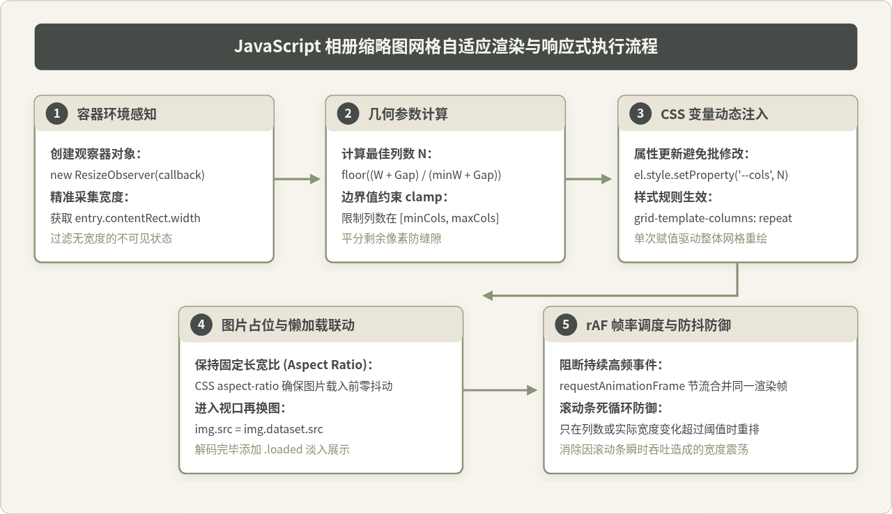
图 3:JavaScript 相册缩略图网格自适应渲染与响应式执行流程
下面是实现核心网格自适应类的关键步骤:
class ResponsiveGallery {
  constructor(container, options = {}) {
    this.container = typeof container === 'string'
      ? document.querySelector(container)
      : container;

    if (!this.container) {
      throw new Error('未找到相册容器元素');
    }

    // 配置参数与兜底默认值
    this.options = Object.assign({
      minItemWidth: 180,  // 单张缩略图期望的最小宽度 (px)
      gap: 16,            // 缩略图间隙 (px)
      minCols: 2,         // 移动端视口下的最小列数
      maxCols: 6,         // 超大显示屏下的最大列数
      aspectRatio: '1 / 1'
    }, options);

    this.currentCols = 0;
    this.currentWidth = 0;
    this.animationFrameId = null;

    this.init();
  }

  init() {
    // 1. 初始化容器基本 CSS 变量
    this.container.style.setProperty('--grid-gap', `${this.options.gap}px`);
    this.container.style.setProperty('--thumb-aspect-ratio', this.options.aspectRatio);

    // 2. 建立高性能容器尺寸监听
    this.setupResizeObserver();

    // 3. 联动图片懒加载
    this.setupLazyLoading();
  }

  /**
   * 核心计算与更新方法
   * 采用单次计算,只在列数发生实质性阶跃时触发 CSS 变量重写
   */
  updateLayout(containerWidth) {
    const { minItemWidth, gap, minCols, maxCols } = this.options;

    if (containerWidth <= 0) return;

    // 依照前文数学公式计算最佳列数
    let cols = Math.floor((containerWidth + gap) / (minItemWidth + gap));
    cols = Math.max(minCols, Math.min(maxCols, cols));

    // 如果列数与之前一致,无需改动 DOM
    if (cols === this.currentCols && Math.abs(containerWidth - this.currentWidth) < 2) {
      return;
    }

    this.currentCols = cols;
    this.currentWidth = containerWidth;

    // 将计算结果以 CSS 变量注入,单次赋值触发原生网格自适应
    this.container.style.setProperty('--grid-cols', cols);
  }
}
五、响应式监听与性能防抖:基于 ResizeObserver 的优雅重排
传统的前端教程往往习惯监听 window.addEventListener('resize', ...)。但在复杂单页应用或现代响应式后台中,相册常常位于可伸缩的侧边栏右侧。当用户拖拽侧边栏时,浏览器窗口本身的 innerWidth 毫无变化,但相册容器却在持续变形。
因此,现代标准必须采用 ResizeObserver 针对相册容器本身进行精准监听。与此同时,容器变形时会高频触发尺寸回调,若直接在回调中修改样式,很容易引起强制同步布局(Forced Synchronous Layout)。为此,我们通过 requestAnimationFrame 将重排计算任务合并至浏览器下一次重绘周期:
setupResizeObserver() {
  if (!('ResizeObserver' in window)) {
    // 降级兜底方案:监听全局 window resize
    window.addEventListener('resize', () => {
      this.scheduleUpdate(this.container.clientWidth);
    });
    this.scheduleUpdate(this.container.clientWidth);
    return;
  }

  this.resizeObserver = new ResizeObserver((entries) => {
    for (const entry of entries) {
      // 优先读取 contentRect,不存在时使用 contentBoxSize
      let width = 0;
      if (entry.contentBoxSize) {
        const boxSize = Array.isArray(entry.contentBoxSize)
          ? entry.contentBoxSize[0]
          : entry.contentBoxSize;
        width = boxSize.inlineSize;
      } else {
        width = entry.contentRect.width;
      }

      this.scheduleUpdate(width);
    }
  });

  this.resizeObserver.observe(this.container);
}

scheduleUpdate(width) {
  // 如果当前帧已排队,则取消上一帧排队,确保永远处理最新视口
  if (this.animationFrameId) {
    cancelAnimationFrame(this.animationFrameId);
  }

  this.animationFrameId = requestAnimationFrame(() => {
    this.updateLayout(width);
    this.animationFrameId = null;
  });
}避坑要点:切忌在 ResizeObserver 回调内部直接读取 offsetHeight 或执行会改变容器边框宽度的同步样式修改。这极易触发浏览器的 ResizeObserver loop completed with undelivered notifications 错误。使用 requestAnimationFrame 能够彻底规避该报错。
六、缩略图懒加载与消除累积布局偏移(CLS)
网格就绪后,缩略图的加载策略直接决定了页面的流畅度。相册往往包含数十乃至上百张图片,如果首屏直接发起所有图片的网络请求,将严重堵塞网络信道。
这里我们结合原生 IntersectionObserver 实现视口感知懒加载:只有当某个缩略图卡片即将滑入视口上方 200px 范围时,才将其 data-src 赋值给真实的 src。
setupLazyLoading() {
  const images = this.container.querySelectorAll('.thumb-img[data-src]');
  if (!images.length) return;

  if (!('IntersectionObserver' in window)) {
    // 不支持时全部同步加载
    images.forEach(img => this.loadImage(img));
    return;
  }

  this.imageObserver = new IntersectionObserver((entries, observer) => {
    entries.forEach(entry => {
      if (entry.isIntersecting) {
        const img = entry.target;
        this.loadImage(img);
        observer.unobserve(img); // 加载后即刻取消观察,释放监听
      }
    });
  }, {
    root: null,          // 默认为视口
    rootMargin: '200px', // 提前 200px 预加载,平滑无感知
    threshold: 0.01
  });

  images.forEach(img => this.imageObserver.observe(img));
}

loadImage(img) {
  const realSrc = img.getAttribute('data-src');
  if (!realSrc) return;

  // 使用内存 Image 对象预解码,杜绝大图渲染掉帧
  const tempImg = new Image();
  tempImg.src = realSrc;
  tempImg.onload = () => {
    img.src = realSrc;
    img.removeAttribute('data-src');
    img.classList.add('is-loaded');
  };
  tempImg.onerror = () => {
    img.classList.add('is-error');
    img.alt = '图片加载失败';
  };
}
七、完整可执行的相册实现代码
将上述所有模块整合成一个开箱即用的模块化组件,并提供资源回收机制(在单页应用组件卸载时调用 destroy() 避免内存泄漏):
/**
 * ResponsiveAlbumGrid
 * 原生高性能响应式相册网格管理器
 */
class ResponsiveAlbumGrid {
  constructor(selectorOrElement, options = {}) {
    this.container = typeof selectorOrElement === 'string'
      ? document.querySelector(selectorOrElement)
      : selectorOrElement;

    if (!this.container) {
      console.warn('ResponsiveAlbumGrid: 目标容器不存在');
      return;
    }

    this.options = {
      minItemWidth: 200,
      gap: 16,
      minCols: 2,
      maxCols: 6,
      aspectRatio: '1 / 1',
      ...options
    };

    this.currentCols = 0;
    this.currentWidth = 0;
    this.rAF = null;
    this.resizeObserver = null;
    this.lazyObserver = null;

    this.init();
  }

  init() {
    this.container.style.setProperty('--grid-gap', `${this.options.gap}px`);
    this.container.style.setProperty('--thumb-aspect-ratio', this.options.aspectRatio);

    this.initResizeObserver();
    this.refreshLazyImages();
  }

  initResizeObserver() {
    if ('ResizeObserver' in window) {
      this.resizeObserver = new ResizeObserver(entries => {
        for (const entry of entries) {
          const width = entry.contentRect.width;
          this.queueLayoutUpdate(width);
        }
      });
      this.resizeObserver.observe(this.container);
    } else {
      this.onResizeFallback = () => this.queueLayoutUpdate(this.container.clientWidth);
      window.addEventListener('resize', this.onResizeFallback);
      this.queueLayoutUpdate(this.container.clientWidth);
    }
  }

  queueLayoutUpdate(width) {
    if (this.rAF) cancelAnimationFrame(this.rAF);
    this.rAF = requestAnimationFrame(() => {
      this.recalculate(width);
      this.rAF = null;
    });
  }

  recalculate(width) {
    if (!width || width <= 0) return;
    const { minItemWidth, gap, minCols, maxCols } = this.options;

    let cols = Math.floor((width + gap) / (minItemWidth + gap));
    cols = Math.max(minCols, Math.min(maxCols, cols));

    if (cols !== this.currentCols) {
      this.currentCols = cols;
      this.container.style.setProperty('--grid-cols', cols);
      // 触发列数变化自定义事件,方便上层业务联动(如分页重置)
      this.container.dispatchEvent(new CustomEvent('grid:cols-change', {
        detail: { columns: cols, containerWidth: width }
      }));
    }
  }

  refreshLazyImages() {
    if (this.lazyObserver) {
      this.lazyObserver.disconnect();
    }

    const pendingImages = this.container.querySelectorAll('.thumb-img[data-src]');
    if (!pendingImages.length) return;

    if ('IntersectionObserver' in window) {
      this.lazyObserver = new IntersectionObserver((entries, obs) => {
        entries.forEach(entry => {
          if (entry.isIntersecting) {
            const img = entry.target;
            const src = img.dataset.src;
            if (src) {
              img.src = src;
              img.onload = () => img.classList.add('is-loaded');
              img.onerror = () => img.classList.add('is-failed');
              img.removeAttribute('data-src');
            }
            obs.unobserve(img);
          }
        });
      }, { rootMargin: '150px 0px' });

      pendingImages.forEach(img => this.lazyObserver.observe(img));
    } else {
      pendingImages.forEach(img => {
        img.src = img.dataset.src;
        img.classList.add('is-loaded');
      });
    }
  }

  /**
   * 动态追加新相片(例如下拉滚动加载下一页)
   */
  appendPhotos(photosHtml) {
    this.container.insertAdjacentHTML('beforeend', photosHtml);
    this.refreshLazyImages();
  }

  /**
   * 组件卸载,释放内存
   */
  destroy() {
    if (this.rAF) cancelAnimationFrame(this.rAF);
    if (this.resizeObserver) this.resizeObserver.disconnect();
    if (this.lazyObserver) this.lazyObserver.disconnect();
    if (this.onResizeFallback) {
      window.removeEventListener('resize', this.onResizeFallback);
    }
  }
}

// 实例化调用示例
document.addEventListener('DOMContentLoaded', () => {
  const gallery = new ResponsiveAlbumGrid('#photoGallery', {
    minItemWidth: 220,
    gap: 16,
    minCols: 2,
    maxCols: 5
  });
});
八、生产环境避坑指南
在实际项目部署中,相册缩略图网格经常会遭遇一些隐蔽的边缘问题,需要提前做好防御:
- 垂直滚动条导致的“尺寸死循环震荡”:当相册图片加载后页面高度超出视口,浏览器会自动出现垂直滚动条(通常占用 15px~17px 宽度)。此时容器宽度缩窄,可能刚好跌落列数临界点,列数减 1 导致相册变高;反之,若列数减少导致高度收缩又移除了滚动条,便会触发死循环抽搐。解决办法:在页面全局 CSS 设置
html { scrollbar-gutter: stable; }或overflow-y: scroll;预留固定滚动条槽位。 - 亚像素(Sub-pixel)四舍五入裂缝:不同浏览器渲染引擎在计算
(100% - gap) / 3时,偶尔会产生 0.33px 或 0.67px 的误差。通过在容器上使用 CSS Grid 默认的minmax(0, 1fr)而非百分比浮动(float / inline-block),浏览器底层会自动对像素误差进行吸收平摊。 - 大图异步加载引起的白屏假死:不要直接在相册中加载 4K 级别的原图。相册缩略图网格应始终请求服务端生成的专用 WebP/AVIF 缩略图(例如宽度 400px~600px),仅在用户点击弹窗查看大图(Lightbox)时才加载高清原文件。
九、总结与全景决策
实现一套优秀的相册缩略图网格,并非单纯依赖某一项特定技术,而是将现代 Web 标准的各项长处进行有机整合:
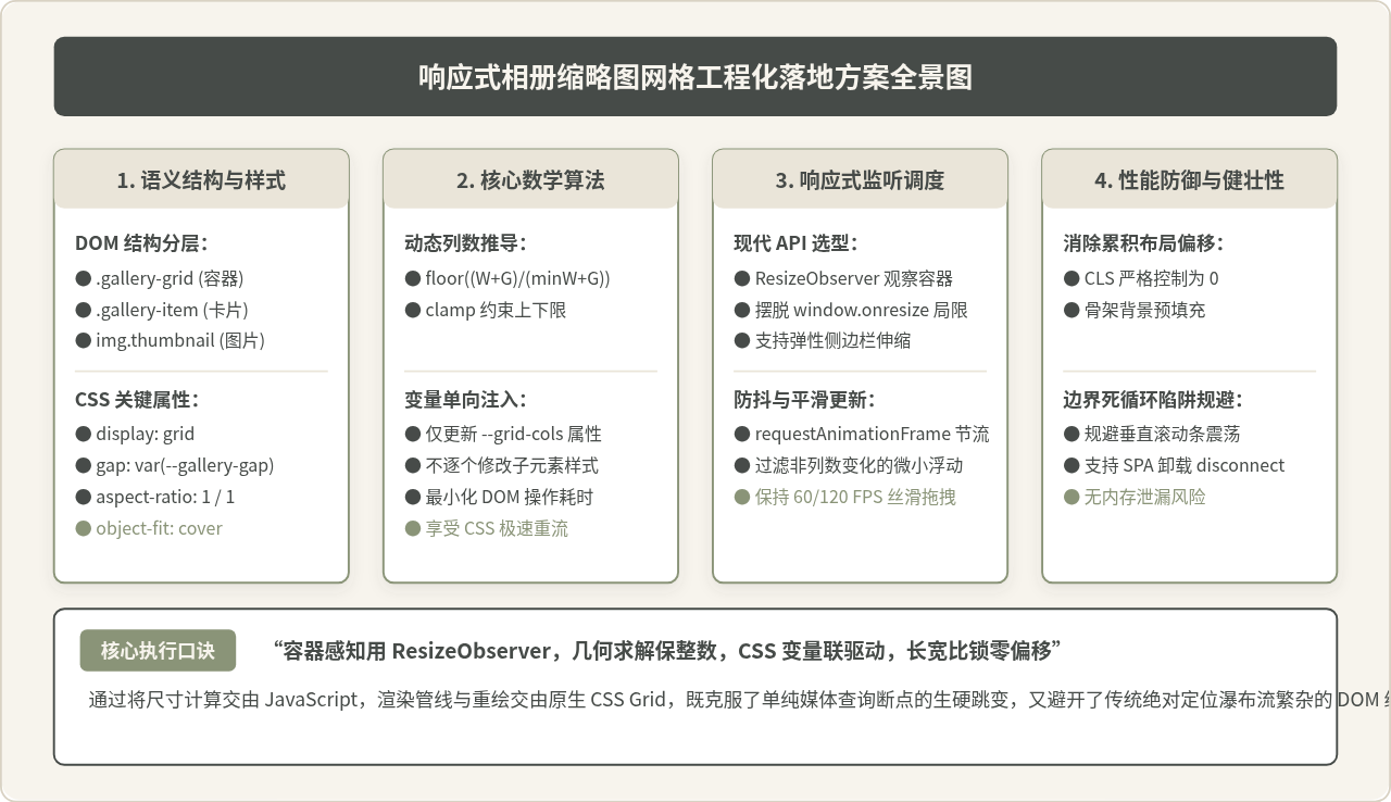
图 4:响应式相册缩略图网格工程化落地方案全景图
回顾本文实现的完整闭环:
- 结构层:利用
aspect-ratio: 1 / 1与骨架屏预填充,将累计布局位移(CLS)压低至 0,保障极致的首屏稳定性; - 算法层:通过严谨的向下取整数学公式解出最优列数,配合数值边界裁剪,确保不同视口下的排版比例自然匀称;
- 调度层:引入
ResizeObserver精准捕获容器级尺寸突变,配合requestAnimationFrame消除频繁重排引起的卡顿; - 渲染层:将最终计算得到的列数收敛为单个 CSS 变量
--grid-cols进行单向更新,让浏览器原生网格引擎承担高效重绘工作。
按照这种分层协作的思想构建的相册网格,无论是在几百像素宽的手机屏幕,还是在支持拖拽缩放的复杂工作台界面,都能兼具优雅的表现力与卓越的工程性能。
实用工具推荐
电子包浆
使用 ›绿化、压缩、噪点和虚拟水印,自由调节做旧程度。
图片压缩
使用 ›选择画质和输出格式,预览压缩前后的大小。
作者最新文章
相关文章