
深入讲解如何使用原生HTML、CSS和JavaScript构建美观、非阻塞、具备无障碍特性的自定义模态框,并通过Promise封装彻底替代原生window.alert。

当前位置:首页 > JavaScript DOM 与事件 > 正文
怎么用CSS和JS自定义美观的模态框替代原生alert
作者:像素漫游
时间:2026-11-19
浏览:347
文章目录
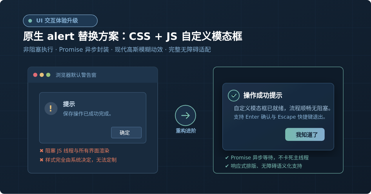
在表单提交完成或执行关键操作后,使用 window.alert('保存成功') 是许多开发者最先想到的提示方式。然而,原生 alert 会直接冻结整个浏览器的 UI 渲染与 JavaScript 线程,弹出的系统级窗口样式刻板且无法修改。要彻底替换原生 alert,最标准的路径是:通过 HTML 组织语义结构,借助 CSS 构建带有高斯模糊与缩放微动效的遮罩层,最后用 JavaScript 将模态逻辑封装为一个返回 Promise 的异步函数。这样既能保留类似 await customAlert('保存成功') 的线型调用直觉,又能享受非阻塞的流畅视觉体验。
一、为什么要替换原生 alert?(核心机制深度剖析)
原生 window.alert() 的最大痛点并非仅仅是视觉上的单调,更关键的是其底层的同步阻塞机制。当代码执行到 alert 时,浏览器内核会暂停当前页面的事件循环(Event Loop),无论是 CSS 关键帧动画、GIF 图播动、网页内的倒计时器,还是后续的网络请求与 DOM 渲染,都会瞬间进入停滞状态,直到用户亲手点击确定按钮。
此外,原生弹窗无法定制按钮文字,无法添加品牌配色与状态图标,且在不同操作系统和浏览器内核下的弹窗外观各异,严重割裂了现代 Web 应用的一致性体验。构建一个自定义的异步模态框,不仅能让视觉表现完全受 CSS 掌控,还能让后台任务与动画持续平稳运行。
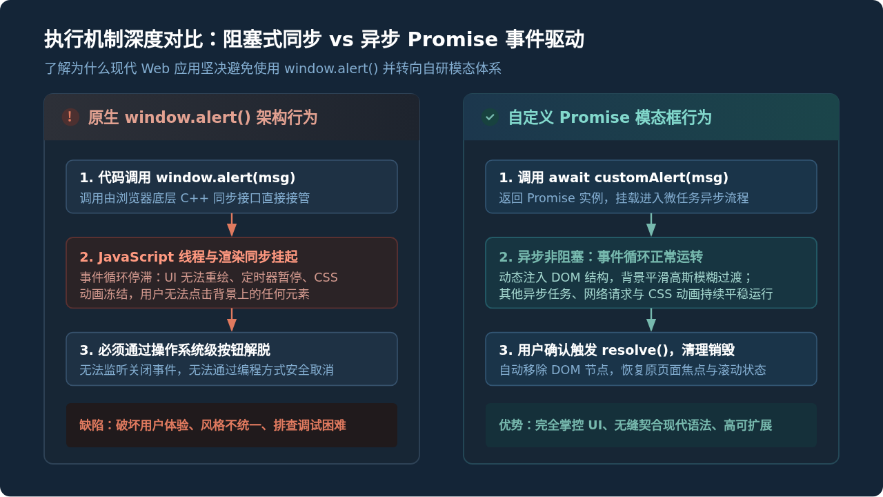
如上图所示,自定义模态框将提示操作接入了 JavaScript 的微任务与宏任务队列中,当弹窗打开时,用户依然能感受到顺滑的磨砂背景过渡,页面后台状态亦不会发生非预期的时间停滞。
二、模态框的 HTML 结构与语义化设计
为了保证弹窗在屏幕阅读器及无障碍辅助设备(A11y)中能够被正确识别,我们不应该随意堆叠 <div>,而是需要声明明确的 WAI-ARIA 属性:
role="dialog":告知无障碍设备当前元素为一个对话框组件。aria-modal="true":向辅助设备声明该对话框是模态的,底层页面的交互处于阻断状态。aria-labelledby与aria-describedby:分别绑定标题与正文段落的 ID,方便视障用户朗读内容。
以下是模态框标准的基础 DOM 结构范式:
<!-- 全屏遮罩层容器 -->
<div class="custom-alert-overlay" role="dialog" aria-modal="true" aria-labelledby="custom-alert-title" aria-describedby="custom-alert-desc">
  <!-- 居中对话框卡片 -->
  <div class="custom-alert-card">
    <!-- 顶部标题与图标区 -->
    <div class="custom-alert-header">
      <div class="custom-alert-icon">
        <svg viewBox="0 0 24 24" width="22" height="22" fill="none" stroke="currentColor" stroke-width="2">
          <circle cx="12" cy="12" r="10"></circle>
          <line x1="12" y1="8" x2="12" y2="12"></line>
          <line x1="12" y1="16" x2="12.01" y2="16"></line>
        </svg>
      </div>
      <h3 id="custom-alert-title" class="custom-alert-title">提示</h3>
    </div>
    <!-- 提示正文 -->
    <div id="custom-alert-desc" class="custom-alert-body">操作已完成</div>
    <!-- 底部按钮交互区 -->
    <div class="custom-alert-footer">
      <button type="button" class="custom-alert-btn">我知道了</button>
    </div>
  </div>
</div>
三、用 CSS 构建现代化视觉与微交互动画
模态框的视觉层次主要由三部分构成:底层的宿主业务页面、中层的半透明虚化遮罩层(Overlay),以及顶层的对话框卡片(Card)。通过 z-index 建立清晰的堆叠上下文,并配合 CSS backdrop-filter 与关键帧动画,可以营造出轻盈的现代质感。
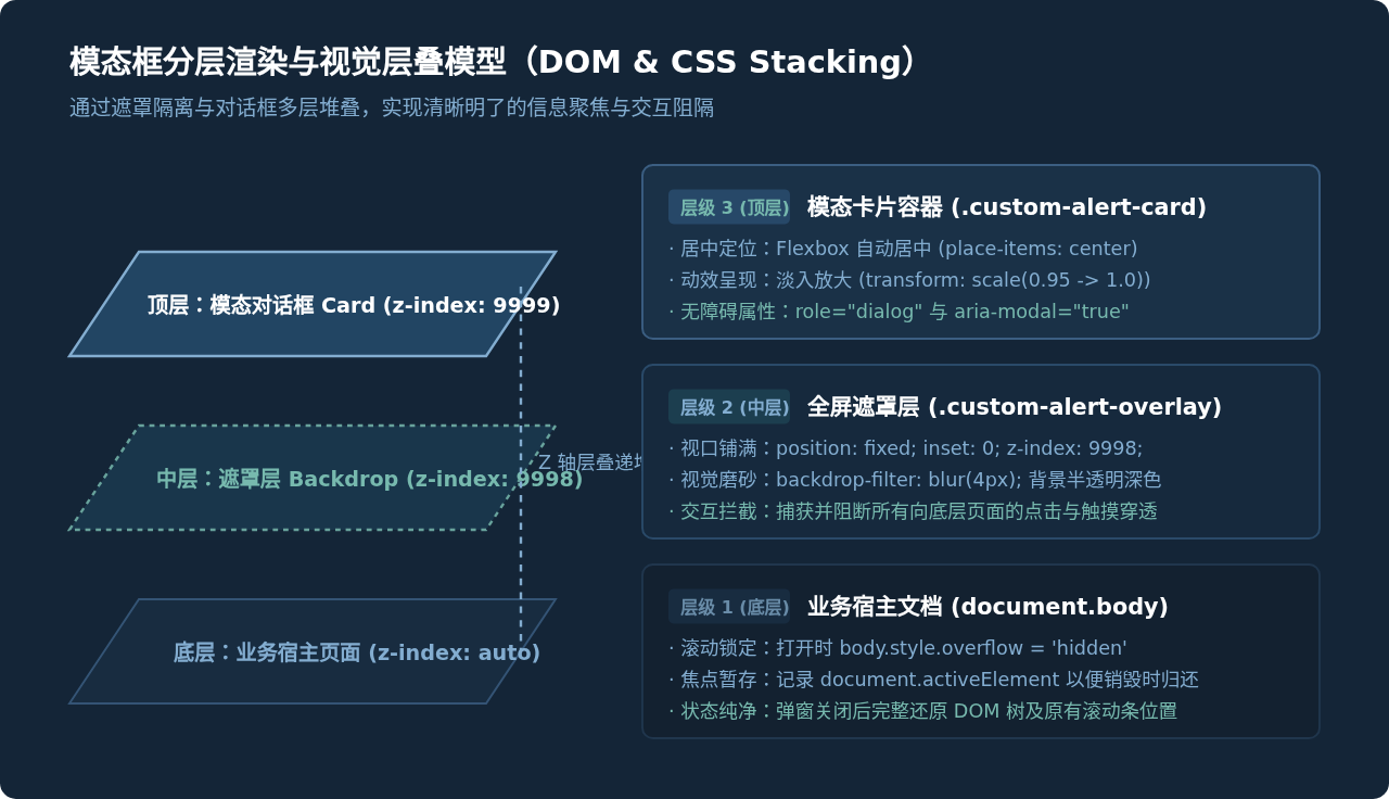
在编写样式时,我们将遮罩设置为 fixed 全屏覆盖,并利用 Flexbox 实现水平和垂直居中。同时,定义淡入缩放(Enter)与淡出反向微缩放(Exit)两组关键帧:
/* 遮罩层样式:全屏铺满与高斯模糊 */
.custom-alert-overlay {
  position: fixed;
  inset: 0;
  z-index: 9999;
  background-color: rgba(15, 23, 42, 0.65);
  backdrop-filter: blur(4px);
  -webkit-backdrop-filter: blur(4px);
  display: flex;
  align-items: center;
  justify-content: center;
  padding: 16px;
  animation: customOverlayFadeIn 0.2s cubic-bezier(0.16, 1, 0.3, 1) forwards;
}

/* 模态卡片样式:阴影、圆角与微缩放入场 */
.custom-alert-card {
  width: 100%;
  max-width: 420px;
  background: #ffffff;
  border-radius: 12px;
  box-shadow: 0 20px 25px -5px rgba(0, 0, 0, 0.2), 0 8px 10px -6px rgba(0, 0, 0, 0.1);
  padding: 24px;
  transform-origin: center center;
  animation: customCardScaleIn 0.25s cubic-bezier(0.16, 1, 0.3, 1) forwards;
}

/* 标题区与图标排版 */
.custom-alert-header {
  display: flex;
  align-items: center;
  gap: 12px;
  margin-bottom: 12px;
}
.custom-alert-icon {
  color: #0284c7;
  display: flex;
  align-items: center;
  justify-content: center;
}
.custom-alert-title {
  font-size: 18px;
  font-weight: 700;
  color: #0f172a;
  margin: 0;
}

/* 提示文本 */
.custom-alert-body {
  font-size: 14.5px;
  color: #475569;
  line-height: 1.6;
  margin-bottom: 24px;
  word-break: break-word;
}

/* 操作按钮 */
.custom-alert-footer {
  display: flex;
  justify-content: flex-end;
}
.custom-alert-btn {
  background-color: #0284c7;
  color: #ffffff;
  border: none;
  padding: 9px 20px;
  font-size: 14px;
  font-weight: 600;
  border-radius: 6px;
  cursor: pointer;
  transition: background-color 0.15s ease, transform 0.1s ease;
  outline: none;
}
.custom-alert-btn:hover {
  background-color: #0369a1;
}
.custom-alert-btn:focus-visible {
  box-shadow: 0 0 0 3px rgba(2, 132, 199, 0.4);
}

/* 退场动画类名 */
.custom-alert-overlay.custom-alert-closing {
  animation: customOverlayFadeOut 0.18s ease-in forwards;
}
.custom-alert-overlay.custom-alert-closing .custom-alert-card {
  animation: customCardScaleOut 0.18s ease-in forwards;
}

/* 动效关键帧定义 */
@keyframes customOverlayFadeIn {
  from { opacity: 0; }
  to { opacity: 1; }
}
@keyframes customOverlayFadeOut {
  from { opacity: 1; }
  to { opacity: 0; }
}
@keyframes customCardScaleIn {
  from { opacity: 0; transform: scale(0.92); }
  to { opacity: 1; transform: scale(1); }
}
@keyframes customCardScaleOut {
  from { opacity: 1; transform: scale(1); }
  to { opacity: 0; transform: scale(0.95); }
}
四、编写可复用的 Promise 化 JS 核心逻辑
原生 alert() 的最直观体验在于“代码执行到此会停住,点完之后才往下走”。在自定义模态框中,实现这一体验的关键在于使用 ES6 Promise 进行包裹。
我们设计一个 customAlert(message, title) 函数,其完整的生命周期包括:暂存页面焦点、锁定背景页面滚动、创建 DOM 节点插入文档、监听键盘与点击事件、执行退场过渡动效、彻底清理 DOM 节点、恢复滚动与焦点,最终调用 resolve() 释放控制权。
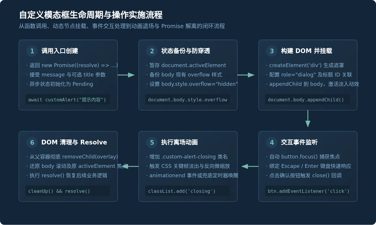
以下是完整的可运行 JavaScript 封装代码:
/**
 * 自定义模态框函数,替代原生 window.alert
 * @param {string} message 提示内容正文
 * @param {string} [title='提示'] 提示框标题
 * @returns {Promise} 用户关闭弹窗后 resolve
 */
function customAlert(message, title = '提示') {
  return new Promise((resolve) => {
    // 1. 暂存当前页面活跃焦点,以便弹窗关闭后正确归还焦点
    const previousActiveElement = document.activeElement;

    // 2. 锁定背景页面滚动,防止移动端或滚轮导致背景内容穿透位移
    const originalBodyOverflow = document.body.style.overflow;
    document.body.style.overflow = 'hidden';

    // 3. 动态创建全屏遮罩根节点
    const overlay = document.createElement('div');
    overlay.className = 'custom-alert-overlay';
    overlay.setAttribute('role', 'dialog');
    overlay.setAttribute('aria-modal', 'true');
    overlay.setAttribute('aria-labelledby', 'custom-alert-title');
    overlay.setAttribute('aria-describedby', 'custom-alert-desc');

    // 4. 组装内部对话框骨架(注意:文本内容通过 textContent 填充,严格预防 XSS)
    overlay.innerHTML = `
      <div class="custom-alert-card">
        <div class="custom-alert-header">
          <div class="custom-alert-icon">
            <svg viewBox="0 0 24 24" width="22" height="22" fill="none" stroke="currentColor" stroke-width="2">
              <circle cx="12" cy="12" r="10"></circle>
              <line x1="12" y1="8" x2="12" y2="12"></line>
              <line x1="12" y1="16" x2="12.01" y2="16"></line>
            </svg>
          </div>
          <h3 id="custom-alert-title" class="custom-alert-title"></h3>
        </div>
        <div id="custom-alert-desc" class="custom-alert-body"></div>
        <div class="custom-alert-footer">
          <button type="button" class="custom-alert-btn">我知道了</button>
        </div>
      </div>
    `;

    // 填充安全文本
    const titleEl = overlay.querySelector('.custom-alert-title');
    const bodyEl = overlay.querySelector('.custom-alert-body');
    const confirmBtn = overlay.querySelector('.custom-alert-btn');
    const cardEl = overlay.querySelector('.custom-alert-card');

    titleEl.textContent = title;
    bodyEl.textContent = message;

    // 5. 核心关闭与解离流程
    let isClosing = false;
    const handleClose = () => {
      if (isClosing) return;
      isClosing = true;

      // 移除键盘监听
      window.removeEventListener('keydown', handleKeyDown, true);

      // 触发 CSS 退场关键帧动画
      overlay.classList.add('custom-alert-closing');

      const finalizeCleanup = () => {
        // 从 DOM 彻底卸载节点,避免内存泄漏
        if (overlay.parentNode) {
          overlay.parentNode.removeChild(overlay);
        }
        // 还原 body 滚动状态
        document.body.style.overflow = originalBodyOverflow;
        // 归还元素焦点
        if (previousActiveElement && typeof previousActiveElement.focus === 'function') {
          previousActiveElement.focus();
        }
        // 唤醒 Promise
        resolve();
      };

      // 优先监听动画结束事件,并配置超时兜底(以防动画事件在不可见标签页中未触发)
      cardEl.addEventListener('animationend', finalizeCleanup, { once: true });
      setTimeout(finalizeCleanup, 220);
    };

    // 6. 快捷键监听与焦点锁定:支持 Escape 退出、Enter 确认、Tab 锁定在弹窗内
    const handleKeyDown = (event) => {
      if (event.key === 'Escape' || event.key === 'Enter') {
        event.preventDefault();
        event.stopPropagation();
        handleClose();
      } else if (event.key === 'Tab') {
        // 只有一个交互按钮时,锁定 Tab 焦点循环
        event.preventDefault();
        confirmBtn.focus();
      }
    };

    // 绑定交互事件
    confirmBtn.addEventListener('click', handleClose);
    window.addEventListener('keydown', handleKeyDown, true);

    // 挂载到 body 并聚焦按钮
    document.body.appendChild(overlay);
    confirmBtn.focus();
  });
}
实现要点提醒:在上述代码中,使用了
cardEl.addEventListener('animationend', finalizeCleanup) 与 setTimeout(finalizeCleanup, 220) 双重保障。当浏览器标签处于后台运行或系统开启“减少动态效果(prefers-reduced-motion)”导致动画未实际触发时,定时器能确保 resolve() 必定被执行,绝不卡死业务调用链。
五、实际调用验证与业务迁移对比
在业务代码中,替换原生 alert 非常简单。只需要在原有调用处将 alert(...) 替换为 await customAlert(...):
// 改造前的写法(原生阻塞):
function handleSaveOld() {
  alert('表单已成功保存!');
  window.location.reload();
}

// 改造后的写法(自定义异步模态框):
async function handleSaveNew() {
  // 等待用户点击弹窗中的“我知道了”或按下回车
  await customAlert('表单已成功保存!', '操作反馈');

  // 弹窗完全关闭并清理后,才继续执行页面跳转逻辑
  window.location.reload();
}
执行该函数后,整个界面不会发生生硬的系统弹窗跳动,背景内容被柔和的半透明磨砂遮罩覆盖,弹窗卡片平滑缩放浮现,用户敲击 Enter 或 Escape 键即可随手关闭,后续的业务逻辑继续按序流畅执行。
六、生产环境的四个防御性关键细节
在将自定义模态框应用于正式生产项目时,还需要特别关注以下四个防御性细节:
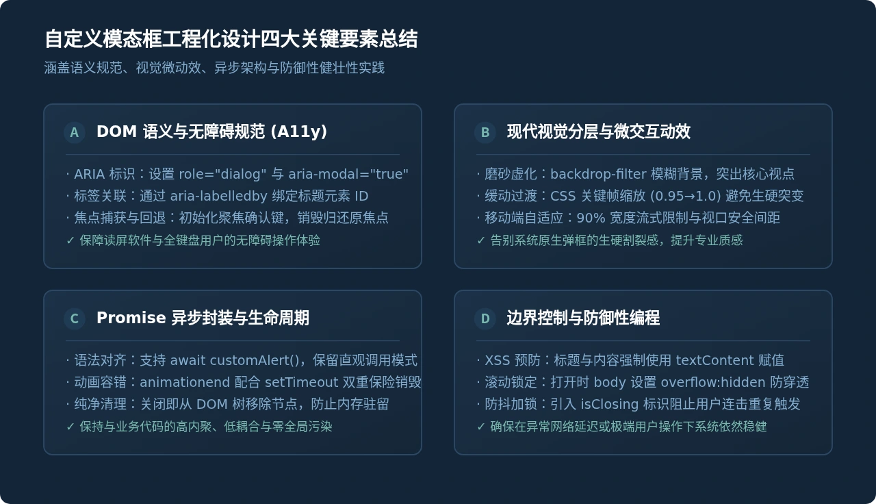
-
彻底隔离 XSS 注入风险:
由于
customAlert常用于输出后端返回的异常信息或接口错误描述,极易包含不可信的用户输入。若使用innerHTML = `<div>${message}</div>`,会直接引发跨站脚本漏洞(XSS)。在本文实现中,我们强制对标题和正文使用textContent赋值,从源头阻断代码注入。 -
防抖与状态锁机制:
用户在快速双击或连续回车时,可能在短时间内多次触发关闭逻辑。代码中设置了
isClosing布尔锁,一旦进入退场流程立即拦截后续重复调用,确保resolve()与 DOM 移除操作只执行一次。 -
移动端滚动与视口适配:
在 iOS Safari 等移动端浏览器中,单纯设置
body.style.overflow = 'hidden'偶发仍有触摸穿透滚动的现象。若需极致适配,可在遮罩层上监听touchmove事件并调用event.preventDefault(),或者在 CSS 中使用overscroll-behavior: contain。 -
多重弹窗队列(Queue)扩展能力:
如果系统在极端场景下连续调用了两次
customAlert,直接重叠弹出可能造成遮挡。对于更大型的项目,可以在customAlert外层维护一个数组队列alertQueue = [],前一个弹窗关闭resolve之后,自动触发队列中的下一个弹窗显示。
实用工具推荐
电子包浆
使用 ›绿化、压缩、噪点和虚拟水印,自由调节做旧程度。
图片压缩
使用 ›选择画质和输出格式,预览压缩前后的大小。
作者最新文章
相关文章