

本文介绍了如何使用JavaScript和CSS结合实现一个动态时钟效果。通过querySelector获取元素,利用setInterval定时更新时针、分针和秒针的旋转角度,展示完整的HTML结构与CSS样式代码,帮助开发者快速掌握前端动态效果的制作技巧。
JS与CSS实现动态时钟的完整代码示例
以下示例展示了利用JavaScript与CSS技术构建动态时钟的具体实现方式,供读者参考学习。
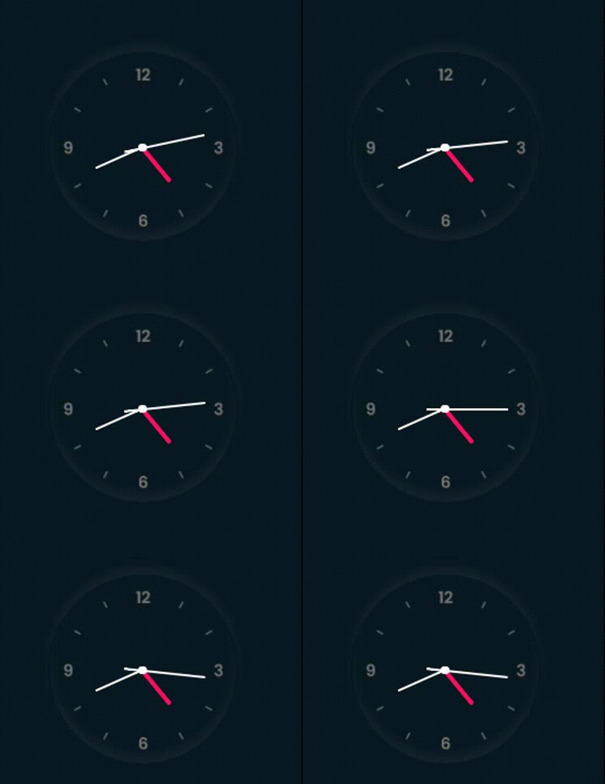
核心知识点梳理
核心知识点梳理:
document.querySelector()函数用于在文档中查找并返回匹配指定CSS选择器的首个元素。
setInterval() 函数用于按指定的时间间隔(毫秒为单位)重复调用函数或执行表达式。 该函数会持续不断地调用目标函数,直到调用 clearInterval() 或窗口关闭为止。setInterval() 返回的唯一ID可作为 clearInterval() 的参数以停止计时器。
HTML结构与JavaScript逻辑部分
HTML结构与JavaScript逻辑部分
<!DOCTYPE html>
<html lang="en">

<head>
 <meta charset="UTF-8">
 <meta http-equiv="X-UA-Compatible" content="IE=edge">
 <meta name="viewport" content="width=device-width, initial-scale=1.0">
 <link rel="stylesheet" href="shiying.css" >
 <title>Document</title>
</head>

<body>
 <div class="clock">
 <div class="hour">
 <div class="hr" id="hr"></div>
 </div>
 <div class="min">
 <div class="mn" id="mn"></div>
 </div>
 <div class="sec">
 <div class="sc" id="sc"></div>
 </div>
 </div>
 <script type="text/javascript">
 const deg = 6;
 const hr = document.querySelector('#hr');
 const mn = document.querySelector('#mn');
 const sc = document.querySelector('#sc');

 setInterval(() => {

 let day = new Date();
 let hh = day.getHours() * 30;
 let mm = day.getMinutes() * deg;
 let ss = day.getSeconds() * deg;

 hr.style.transform = `rotateZ(${(hh) + (mm / 12)}deg)`;
 mn.style.transform = `rotateZ(${mm}deg)`;
 sc.style.transform = `rotateZ(${ss}deg)`;
 })

 </script>
</body>

</html>
CSS样式定义部分
CSS样式定义部分
*{
 margin:0;
 padding:0;
 box-sizing: border-box;
}
body{
 display: flex;
 justify-content: center;
 align-items: center;
 min-height: 100vh;
 background: #091921;
}
.clock{
 width: 350px;
 height: 350px;
 display:flex;
 justify-content: center;
 align-items: center;
 background: url(1613462007944.png);
 background-size: cover;
 border:4px solid #091921;
 border-radius: 50%;
 box-shadow: 0 -15px 15px rgba(255,255,255,0.05),
 inset 0 -15px 15px rgba(255,255,255, 0.05),
 0 -15px 15px rgba(0,0,0,0.05),
 inset 0 -15px 15px rgba(0,0,0, 0.05);
}
.clock:before
{
 content:"";
 position: absolute;
 width: 15px;
 height: 15px;
 background: #fff;
 border-radius: 50%;
 z-index:10000;

}
.clock .hour,
.clock .min,
.clock .sec
{
 position: absolute;

}
.clock .hour, .hr{
 width: 160px;
 height: 160px;
}
.clock .min, .mn{
 width: 190px;
 height: 190px;
}
.clock .sec, .sc{
 width: 230px;
 height: 230px;
}
.hr, .mn, .sc{
 display: flex;
 justify-content: center;
 position: absolute;
 border-radius: 50%;
}
.hr:before{
 content:"";
 position: absolute;
 width: 8px;
 height: 80px;
 background: #ff105e;
 z-index: 10;
 border-radius: 6px 6px 0 0;
}
.mn:before{
 content:"";
 position: absolute;
 width: 4px;
 height: 90px;
 background: #fff;
 z-index: 11;
 border-radius: 6px 6px 0 0;
}
.sc:before{
 content:"";
 position: absolute;
 width: 4px;
 height: 150px;
 background: #fff;
 z-index:12;
 border-radius: 6px 6px 0 0;
}
以上内容即为本文的全部分享,希望能为读者的学习提供有益帮助,同时也欢迎继续支持本站。