

本文分享了一段使用 JavaScript 实现进度条动态加载的完整代码示例。通过 setInterval 定时器控制计数递增,结合 CSS 样式美化进度条外观,直观展示加载过程。代码包含 HTML 结构、CSS 样式及 JS 逻辑,适合前端开发参考学习。
JavaScript 进度条动态加载实现
本文分享了一段使用 JavaScript 实现进度条动态加载的具体代码示例,供读者参考学习。
<!DOCTYPE html>
<html>
<head>
 <meta charset="utf-8">
 <title>进度条</title>
 <script src="http://static.runoob.com/assets/jquery-validation-1.14.0/lib/jquery.js"></script>
 <style type="text/css">
 .container{
 width: 480px;
 margin: 50px;
 }
 .progressBar {
 display: inline-block;
 width: 81%;
 height: 22px;
 background-color: rgba(0,0,0,0.4);
 -webkit-border-radius: 3px;
 -moz-border-radius: 3px;
 border-radius: 3px;
 margin-right: 3%;
 }
 #progressFill {
 width: 0%;
 height: 22px;
 position: relative;
 background-color: #40A4C2;
 border-radius: 3px;
 -webkit-border-radius: 3px;
 -moz-border-radius: 3px;
 background-size: 3em 3em;
 background-image: linear-gradient(-45deg, transparent 0em, transparent 0.8em, #57D1F7 0.9em, #57D1F7 2.1em, transparent 2.1em, transparent 2.9em, #57D1F7 3.1em);
 -webkit-animation: warning-animation 750ms infinite linear;
 -moz-animation: warning-animation 750ms infinite linear;
 animation: warning-animation 750ms infinite linear;
 }
 #progressFill:before {
 content: '';
 position: absolute;
 top: 0;
 left: 0;
 right: 0;
 bottom: 0;
 height: 100%;
 border-radius: 3px;
 -webkit-border-radius: 3px;
 -moz-border-radius: 3px;
 background-image: linear-gradient(to bottom, #40A4C2, rgbA(37, 117, 188, 0.8) 15%, transparent 60%, #40A4C2);
 }
 @-moz-keyframes warning-animation {
 0% {
 background-position: 0 0;
 }
 100% {
 background-position: 3em 0;
 }
 }
 @-webkit-keyframes warning-animation {
 0% {
 background-position: 0 0;
 }
 100% {
 background-position: 3em 0;
 }
 }
 @-ms-keyframes warning-animation {
 0% {
 background-position: 0 0;
 }
 100% {
 background-position: 3em 0;
 }
 }
 @-o-keyframes warning-animation {
 0% {
 background-position: 0 0;
 }
 100% {
 background-position: 3em 0;
 }
 }
 @keyframes warning-animation {
 0% {
 background-position: 0 0;
 }
 100% {
 background-position: 3em 0;
 }
 }
 .progressText, #percentage {
 display: inline-block;
 margin-top: -11px;
 vertical-align: middle;
 }
 </style>
</head>
<body>
 <button id = "begin">点击开始</button>
 <div class="container">
 <span class = "progressBar">
 <div id = "progressFill"></div>
 </span>
 <span class = "progressText"> 进度 </span>
 <span id = "percentage">0%</span>
 </div>
</body>
<script>
 $("#begin").on("click",function(){
 $("#progressFill").animate({
 width: "100%"
 }, 10*1000);
 var count = 0;
 var timer = setInterval(function(){
 count++;
 var percentageValue = count + '%'
 $("#percentage").html(percentageValue);
 if(count >= 100) clearInterval(timer);
 },99)
 })
</script>
</html>
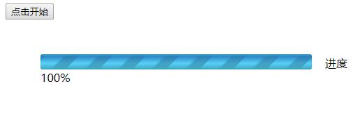
进度条动态加载的实际运行效果如下图所示。
以上就是本文的全部内容,希望对读者的学习有所帮助,同时也欢迎大家继续支持本站。