

本文介绍如何利用JavaScript结合CSS3D实现平滑的鼠标拖拽缓动旋转效果。通过监听鼠标按下与移动事件计算目标角度,并运用requestAnimationFrame在每一帧中按10%的比例逐步逼近目标值,从而实现自然流畅的惯性减速动画,提升页面交互体验。
拖拽缓动效果展示
首先展示最终效果,这是一种体验极佳的拖拽缓动交互,能显著提升页面的视觉质感。
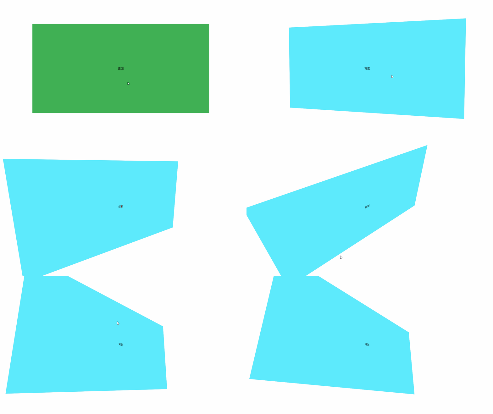
该效果看似简单,却曾困扰许久,为何他人的实现如此流畅?在亲自实现后才发现,之前的思路存在偏差。以下简述该功能的核心实现逻辑。
二维平面拖拽坐标获取
首先需明确,鼠标拖拽操作发生在一个二维平面上。该平面仅包含x轴和y轴,且获取的拖拽数值基于平面像素单位。因此,第一步是通过鼠标事件获取当前的拖拽像素长度。
首先,绑定鼠标按下事件,以获取鼠标相对于浏览器窗口左上角的二维坐标(x, y)。
接着,绑定鼠标移动事件。在移动事件的回调函数中获取当前鼠标坐标,并与按下时的坐标相减,从而计算出拖拽的距离。
像素到旋转角度的转换逻辑
随后,需通过特定比例将拖拽的像素值转换为旋转角度。此处设定的比例为:鼠标横向拖拽10像素,模型沿3D Y轴旋转5度;纵向拖拽10像素,模型沿3D X轴旋转1度。同时设置了旋转范围限制,即X轴旋转角度需保持在-45度至45度之间。
function onDocumentMouseMove(event) {
    mouseX = event.clientX;
    mouseY = event.clientY;
    targetRotationX = targetRotationOnMouseDownX + (mouseX - mouseXOnMouseDownX) * 0.5;
    targetRotationY = Math.min(Math.max((targetRotationOnMouseDownY - (mouseY - mouseXOnMouseDownY) * 0.1), -45), 45); //拖拽后的目标位置
  }
基于上述逻辑获取到目标角度后,关键在于如何实现这种具有惯性(缓动)的旋转效果。
既然已知目标角度,若直接赋值则无法产生预期的缓动效果。那么,具体应如何构建这种惯性动画呢?
基于requestAnimationFrame的缓动实现
接下来,需要引入专门用于动画处理的requestAnimationFrame方法。该方法仅在浏览器准备重绘时运行,最高可达每秒60帧。许多人担心持续递归会导致卡顿或性能问题,实则无需多虑,该方法会根据页面当前性能自动调整帧率,确保运行流畅。
利用该方法实现缓动的核心在于:在每一帧中计算目标角度与当前角度的差值,每次仅移动总进度的10%。你会发现,随着角度越接近目标值,移动速度越慢,从而带来极佳的视觉体验。
在运行过程中,当前角度会无限逼近目标角度。本示例通过CSS3D技术实现上述效果:
function animate() {
    requestAnimationFrame(animate);
    rotateY += (targetRotationX - rotateY) * 0.1;
    rotateX += (targetRotationY - rotateX) * 0.1;
    box.style.transform = 'rotateY(' + rotateY + 'deg)';
    item.style.transform = 'rotateX(' + rotateX + 'deg)';
  }
以下是完整案例代码。
<!DOCTYPE html>
<html lang="zh">

<head>
  <meta charset="UTF-8">
  <title>css3d翻转</title>
  <style>
    * {
      padding: 0;
      margin: 0;
    }

    body {
      display: flex;
      justify-content: center;
      align-items: center;
      height: 100vh;
      overflow: hidden;
      perspective: 1000px;
    }

    .item {
      width: 50vw;
      height: 50vh;
      transform: rotateX(-50deg);
      perspective: 5000px;
      transform-style: preserve-3d;
    }

    .box {
      background: #abb9c5;
      width: 100%;
      height: 100%;
      transform-style: preserve-3d;
      position: relative;
    }

    .font,
    .back {
      position: absolute;
      top: 0;
      left: 0;
      width: 100%;
      height: 100%;
      text-align: center;
      line-height: 50vh;

      background: #4cae4c;

      backface-visibility: hidden;
    }

    .back {
      background: #62ebff;
      transform: rotateY(180deg);
    }
  </style>
</head>

<body>
  <!--item 可以触发翻转的区域-->
  <div class="item">
    <!--box 可以翻转的容器-->
    <div class="box">
      <!--font 默认显示的正面-->
      <div class="font">正面</div>
      <!--back 背面-->
      <div class="back">背面</div>
    </div>
  </div>
</body>
<script>
  var targetRotationX = 0;
  var targetRotationY = 0;
  var targetRotationOnMouseDownX = 0;
  var targetRotationOnMouseDownY = 0;
  var mouseX = 0;
  var mouseY = 0;
  var mouseXOnMouseDownX = 0;
  var mouseXOnMouseDownY = 0;
  var box = document.querySelector('.box');
  var item = document.querySelector('.item');

  var rotateY = 0;
  var rotateX = 0;

  init();
  animate();

  function init() {
    // EVENTS
    document.addEventListener('mousedown', onDocumentMouseDown, false);
    document.addEventListener('touchstart', onDocumentTouchStart, false);
    document.addEventListener('touchmove', onDocumentTouchMove, false);
  }

  function onDocumentMouseDown(event) {
    event.preventDefault();
    document.addEventListener('mousemove', onDocumentMouseMove, false);
    document.addEventListener('mouseup', onDocumentMouseUp, false);
    mouseXOnMouseDownX = event.clientX;
    mouseXOnMouseDownY = event.clientY;
    targetRotationOnMouseDownX = targetRotationX;
    targetRotationOnMouseDownY = targetRotationY;
  }

  function onDocumentMouseMove(event) {
    mouseX = event.clientX;
    mouseY = event.clientY;
    targetRotationX = targetRotationOnMouseDownX + (mouseX - mouseXOnMouseDownX) * 0.5;
    targetRotationY = Math.min(Math.max((targetRotationOnMouseDownY - (mouseY - mouseXOnMouseDownY) * 0.1), -45), 45); //拖拽后的目标位置
  }

  function onDocumentMouseUp() {
    document.removeEventListener('mousemove', onDocumentMouseMove, false);
    document.removeEventListener('mouseup', onDocumentMouseUp, false);
  }

  function onDocumentTouchStart(event) {
    event.preventDefault();
    if (event.touches.length === 1) {
      mouseXOnMouseDownX = event.touches[0].pageX;
      mouseXOnMouseDownY = event.touches[0].pageY;
      targetRotationOnMouseDownX = targetRotationX;
      targetRotationOnMouseDownY = targetRotationY;
    }
  }

  function onDocumentTouchMove(event) {
    event.preventDefault();
    if (event.touches.length === 1) {
      mouseX = event.touches[0].pageX;
      mouseY = event.touches[0].pageY;
      targetRotationX = targetRotationOnMouseDownX + (mouseX - mouseXOnMouseDownX) * 0.5;
      targetRotationY = Math.min(Math.max((targetRotationOnMouseDownY - (mouseY - mouseXOnMouseDownY) * 0.1), -45), 45); //拖拽后的目标位置
    }
  }

  function animate() {
    requestAnimationFrame(animate);
    rotateY += (targetRotationX - rotateY) * 0.1;
    rotateX += (targetRotationY - rotateX) * 0.1;
    box.style.transform = 'rotateY(' + rotateY + 'deg)';
    item.style.transform = 'rotateX(' + rotateX + 'deg)';
  }
</script>

</html>
以上为本文全部内容,希望能为各位的学习提供助力,也欢迎大家继续支持本站。