

本文介绍如何在 elementUI 中实现由后端返回配置的动态表头,并结合 Vue 插槽技术处理不同字段的差异化显示。通过解析后端返回的字段列表,动态生成 el-table-column,并利用 scope.row 和 scope.column.property 在插槽中实现标签、字典值转换等复杂样式渲染,解决高度自定义列表界面的需求。
需求
项目要求实现高度自定义的列表界面,其中表格的表头结构由后端接口返回,并允许用户进行个性化配置。同时,系统需根据用户自定义的表头配置,对表格数据进行不同样式的渲染。例如,某些字段需要以标签形式展示,而另一些字段(如 ID)则需要通过数据字典查询对应的名称(数据字典获取逻辑此处省略)。
效果
一、动态生成表头并填入数据
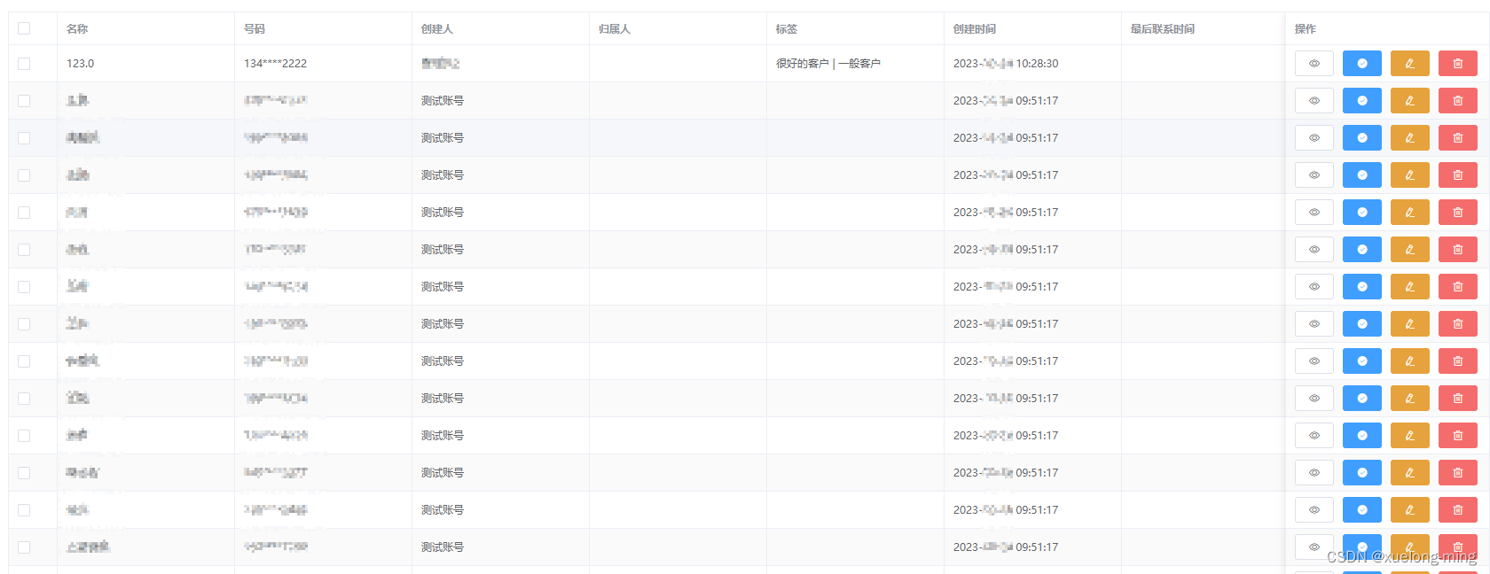
二、动态生成表头并使用插槽
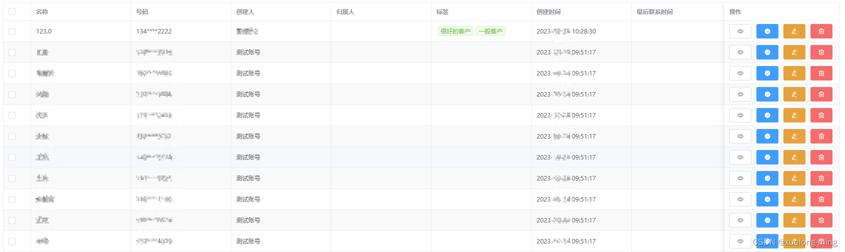
代码
一、动态生成表头并且数据处理
html
<el-table ref="table" :data="tableData" border stripe>
	<el-table-column type="selection" width="55" fixed="left"></el-table-column>
	<el-table-column v-for="item in tableTitleList" :key="item.key" :prop="item.key" :label="item.title" show-overflow-tooltip min-width="200"></el-table-column>
	<el-table-column label="操作" fixed="right" min-width="230">
		<template slot-scope="scope">
			<el-button class="icon-style" icon="el-icon-view" size="mini" @click="onDetails(scope.row)"></el-button>
			<el-button type="primary" class="icon-style" icon="el-icon-success" size="mini" @click="onDetails(scope.row)"></el-button>
			<el-button type="warning" class="icon-style" icon="el-icon-edit" size="mini" @click="onEdit(scope.row)"></el-button>
			<el-button type="danger" class="icon-style" icon="el-icon-delete" size="mini" @click="onDetails(scope.row)"></el-button>
		</template>
	</el-table-column>
</el-table>
js
import api from './api'
export default {
  data() {
    return {
    	loading: false,
    	tableData: [],
    	tableTitleList: []
    }
  },
  created() {
    this.init()
  },
  methods: {
  	// 初始化
    init() {
      // 获取表格中显示字段 解决加载中界面抖动问题
      const individual = JSON.parse(localStorage.getItem('list'))
      this.tableTitleList= individual
      this.loading = true
      this.dictInit().then(async () => {
        await api.init().then(res => {
          if (res.code === 2000) {
            this.tableTitleList = []
            this.tableData = []
            // res.title_list  // 后端返回的表头数据
            // 获取所有启用字段
            res.title_list .map(item => {
              if (item.display === 1) {
                this.tableTitleList.push(item)
              }
            })
            localStorage.setItem('list', JSON.stringify(this.tableTitleList))
            // 获取所有数据
            this.dataProcessing(res.data) // 数据处理
            // 其他操作
            ...
            this.$nextTick(() => {
              this.loading = false
            })
          }
        }).catch(() => {
          this.loading = false
        })
      })
    },
    // 数据处理
    dataProcessing(data) {
    	// 对数据进行处理 简单处理即可
		...
	}
  }
}
后端返回数据
{
    "code": 200,
    "msg": "成功",
    "title_list ": [
        {
            "title": "名称",
            "key": "name",
        },
        {
            "title": "号码",
            "key": "number",
        },
        // 其他字段类似
        ...
    ],
    "data": [
        {
            "name": "123",
            "number": "134****2222",
            "createId": "12",
            "fenpeiId": "13",
            "flag": "37,38",
            "createTime": "2023-10-24 10:28:30"
        },
        // 其他字段类似
        ...
    ],
    "page": 1,
    "total": 1000,
    "limit": 10
}
二、处理后的数据使用插槽
每个单元格中的prop的值:scope.column.property
每个单元格中的值:scope.row[scope.column.property]
html
<el-table ref="table" :data="tableData" border stripe>
	<el-table-column type="selection" width="55" fixed="left"></el-table-column>
	<el-table-column v-for="item in tableTitleList" :key="item.key" :prop="item.key" :label="item.title" show-overflow-tooltip min-width="200">
		<template slot-scope="scope">
			<span v-if="scope.column.property === 'flag'">
				<el-tag type="success" v-for="every in scope.row[scope.column.property]" :key="every" size="mini" style="margin: 0 2px;">{{ every }}</el-tag>
			</span>
			<span v-else>{{ scope.row[scope.column.property] }}</span>
		</template>
	</el-table-column>
	<el-table-column label="操作" fixed="right" min-width="230">
		<template slot-scope="scope">
			<el-button class="icon-style" icon="el-icon-view" size="mini" @click="onDetails(scope.row)"></el-button>
			<el-button type="primary" class="icon-style" icon="el-icon-success" size="mini" @click="onDetails(scope.row)"></el-button>
			<el-button type="warning" class="icon-style" icon="el-icon-edit" size="mini" @click="onEdit(scope.row)"></el-button>
			<el-button type="danger" class="icon-style" icon="el-icon-delete" size="mini" @click="onDetails(scope.row)"></el-button>
		</template>
	</el-table-column>
</el-table>
到此这篇关于elementUI Table 自定义表头动态数据及插槽的操作的文章就介绍到这了,更多相关elementUI Table 自定义表头内容请搜索本站以前的文章或继续浏览下面的相关文章希望大家以后多多支持本站!