

本文介绍基于 UniApp 和 Vue3 开发的单选框组件,具备丝滑的选中动画及多主题配置功能。组件已适配 Web、H5 及微信小程序环境,并提供完整的示例代码与插件市场下载链接,帮助开发者快速集成高性能单选交互组件。
本示例采用 UniApp 结合 Vue3 技术栈,开发了一款单选框组件。该组件不仅提供了流畅的选中动画效果,还支持多种主题配置,能够兼容 Web、H5 以及微信小程序平台(其他小程序平台尚未进行测试,开发者可自行验证)。
插件下载与获取
如需直接体验或获取源码,可前往插件市场下载尝试:https://ext.dcloud.net.cn/plugin?id=16821
组件使用示例
以下是具体的使用示例说明。
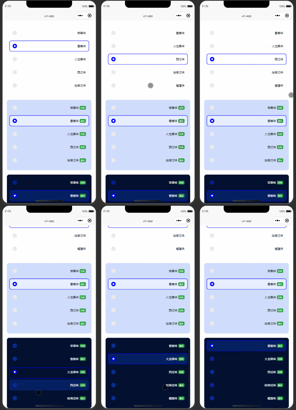
参考以下示例代码进行配置与调用。
核心代码实现
<template>
	<view>
		<view class="light" style="background-color: white">
			<wo-radio v-model:options="state.items" v-model:defaultValue="state.default" @on-change="changeEvent">
			</wo-radio>
		</view>
		<view class="light">
			<wo-radio v-model:options="state.items" v-model:defaultValue="state.default" v-model:styleObj="state.theme.light" v-slot="slotProps" @on-change="changeEvent">
				<view style="display: flex;">
					<view>{{ slotProps.data.name }}</view>
					<view class="tag">{{ slotProps.data.tag }}</view>
				</view>
			</wo-radio>
		</view>
		<view class="dark">
			<wo-radio v-model:options="state.items" v-model:defaultValue="state.default" v-model:styleObj="state.theme.dark" v-slot="slotProps" @on-change="changeEvent">
				<view style="display: flex;">
					<view>{{ slotProps.data.name }}</view>
					<view class="tag">{{ slotProps.data.tag }}</view>
				</view>
			</wo-radio>
		</view>
	</view>
</template>
<script setup lang="ts">
	import { reactive } from 'vue';
	const state = reactive({
	  items: [{
				value: '1',
				name: '苹果味',
				tag: '饮料'
			},
			{
				value: '2',
				name: '香蕉味',
				tag: '酒水'
			},
			{
				value: '3',
				name: '火龙果味',
				tag: '饮料'
			},
			{
				value: '4',
				name: '西瓜味',
				tag: '饮料'
			},
			{
				value: '5',
				name: '哈密瓜味',
				tag: '酒水'
			},
			{
				value: '6',
				name: '榴莲味',
				tag: '酒水'
		}],
		default: '2',
		theme: {
				light: {
					primary: 'blue',
					unselectedRadioBg: '#eaeaea',
					selectedBg: 'hsla(0,0%,100%,0.5)',
					height: 20
				},
				dark: {
					primary: 'blue',
					unselectedRadioBg: 'hsl(223,90%,30%)',
					selectedBg: 'hsla(223,90%,30%,0.5)',
					height: 20
				}
		},
		height: 12
	});
	const changeEvent = (el) => {
		console.log('点击:', el);
	}
</script>
<style lang="scss" scoped>
	.light {
		border-radius: 10px;
		padding: 20rpx;
		font-size: 24rpx;
		background-color: hsl(223,90%,90%);
		margin: 20px;
		height: 300px;
		overflow: auto;
	}
	.dark {
		border-radius: 10px;
		padding: 20rpx;
		font-size: 24rpx;
		background-color: hsl(223,90%,10%);
		color: white;
		margin: 20px;
		height: 300px;
		overflow: auto;
	}
	.tag {
		background-color: #1BA035;
		color: white;
		font-size: 10px;
		display: flex;
		align-items: center;
		justify-content: center;
		border-radius: 4px;
		padding: 0 4px;
		margin-left: 5px;
	}
</style>
总结
至此,关于 UniApp 实现单选框的功能介绍完毕。如需了解更多相关内容,建议查阅本站过往文章或继续浏览后续教程,感谢大家的支持。