

本文详细介绍uniapp中uni-popup组件的具体使用方法。涵盖从创建自定义组件、页面引入与引用,到控制弹出层位置(top/bottom/left/right/center)、设置背景色、禁用动画及遮罩关闭等高级配置。通过实际代码示例,帮助开发者快速实现消息提示、底部菜单等常见交互效果。
uni-popup是uniapp提供的弹出层组件,用于在应用中显示消息提示、确认框等交互窗口。开发者可以灵活设置弹出层的位置,支持中间、底部或顶部等多种布局方式。
如上图所示,白色区域即为弹出的pop层展示效果。
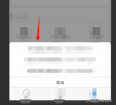
一、 创建一个自定义组件:
1.在项目中安装并下载uni-popup插件。
2.将pop层的内容单独封装为一个组件,存放于components目录下。其中type="bottom"用于指定pop层在屏幕上的展示位置。
<template>
    <view>
        <uni-popup ref="cityPhonePop" type="bottom">
            <view class="popup-content">
                <view class="contentPop columnPop">
                    <block v-for="(item,index) in array">
                        <view class="columnPop itemPop" @click="callPhone(item)">
                            <text>{{item.name}}:{{item.phone}}</text>
                        </view>
                    </block>
                    <view style="background:#f3f3f3;height:10rpx;width: 100%;"></view>
                    <view
                        style="min-height: 70rpx;display: flex; align-items: center;width: 100%;justify-content: center;"
                        @click="closeInfoPop">
                        <text>取消</text>
                    </view>
                </view>
            </view>
        </uni-popup>
    </view>
</template>
在methods中定义所需的JS方法,具体实现如下:
    methods: {
            closeInfoPop() {
                this.$refs.cityPhonePop.close()
            },
            //拨打电话
            callPhone(item) {
                var that = this;
                uni.makePhoneCall({
                    phoneNumber: item.phone,
                    // phoneNumber: '025-83582006',
                    success: (res) => {
                        console.log('调用成功!')
                        that.closeInfoPop();
                    },
                    fail: (res) => {
                        console.log('调用失败!')
                    }
                });
            },
            open() {
                //cityPhonePop是上面布局定义的uni-pop 的ref后面的名称, this.$refs.cityPhonePop.open()则打开pop展示。
                this.$refs.cityPhonePop.open()
            },
            close() {
                this.$refs.cityPhonePop.close()
            }
        }
至此,该组件定义完成。
二、页面中使用上面创建的自定义组件:
1.首先在页面中引入该组件,并在components选项中声明,随后即可通过cityPhone名称使用该组件。
import cityPhone from "@/components/cityPhone.vue"
    export default {
        components: {
            cityPhone
        },
<script>
    import cityPhone from "@/components/cityPhone.vue"
    export default {
        components: {
            cityPhone
        },
    },
    methods: {
            cityList: function() {
                this.$refs.phonePop.open()
            }
    }
</scripty>
2.在页面模板中调用此组件,具体代码示例如下:
<template>
         <view>
                <view @click="cityList()" style="padding:0;margin:0;background-color: #FFFFFF;"
                    class="member-benefits-1">
                    地市列表
                </view>
         <!--城市选择弹窗 -->
                <cityPhone  ref="phonePop"></cityPhone>
        </view>
</template>
3.展示pop层。当点击地市列表时,触发cityList方法,该方法负责打开pop窗口。
this.$refs.phonePop.open()phonePop是步骤2布局中cityPhone组件ref属性后跟的名称。
this.$refs.phonePop.open()  //此open方法实际上是调用的。组件中的open方法,即下图方法。
open() {
                //cityPhonePop是上面布局定义的uni-pop 的ref后面的名称,即pop名 this.$refs.cityPhonePop.open()则打开pop展示。
                this.$refs.cityPhonePop.open()
            },
三、pop组件,扩展详情说明
1.pop层的位置既可以在布局中通过type属性设置,也可以在调用open方法时通过参数传入位置信息。
 // 通过组件定义的ref调用uni-popup方法 ,如果传入参数 ,type 属性将失效 ,仅支持 ['top','left','bottom','right','center']
 this.$refs.popup.open('top')
2. 设置主窗口背景色
在大多数场景下,并不需要设置background-color属性。
但在某些特殊情况下,需要主动设置背景色。例如当type='bottom'时,在异型屏(如iPhone 11)中可能会遇到底部安全区问题。由于uni-popup的主要内容避开了安全区(设置safe-area:true),导致底部颜色无法自定义,此时使用background-color属性即可解决该问题。
<button @click="open">打开弹窗</button>
<uni-popup ref="popup" type="bottom" background-color="#fff">底部弹出 Popup</uni-popup>
3.禁用打开动画
在某些场景下,可能不希望弹层有动画效果,只需将animation属性设置为false即可关闭动画。
<button @click="open">打开弹窗</button>
<uni-popup ref="popup" type="center" :animation="false">中间弹出 Popup</uni-popup>
4.禁用点击遮罩关闭
默认情况下,点击遮罩会自动关闭uni-popup。如果不想点击关闭,只需将mask-click设置为false。此时要关闭uni-popup,只能手动调用close方法。
<uni-popup ref="popup" :mask-click="false">
    <text>Popup</text>
    <button @click="close">关闭</button>
</uni-popup>
到此这篇关于uniapp中uni-popup的具体使用的文章就介绍到这了,更多相关uniapp uni-popup内容请搜索本站以前的文章或继续浏览下面的相关文章希望大家以后多多支持本站!