

本文介绍了如何在移动端使用JavaScript实现触屏拖拽功能。通过监听touchstart、touchmove和touchend事件,结合CSS绝对定位,可以创建可交互的拖动元素。文章提供了完整的HTML和JS代码示例,帮助开发者掌握移动端手势处理的核心技巧。
移动端触屏拖拽实现原理
本文将详细介绍如何利用JavaScript在移动端设备上实现触屏拖拽交互功能,具体实现方案如下。
最终效果如下图所示:
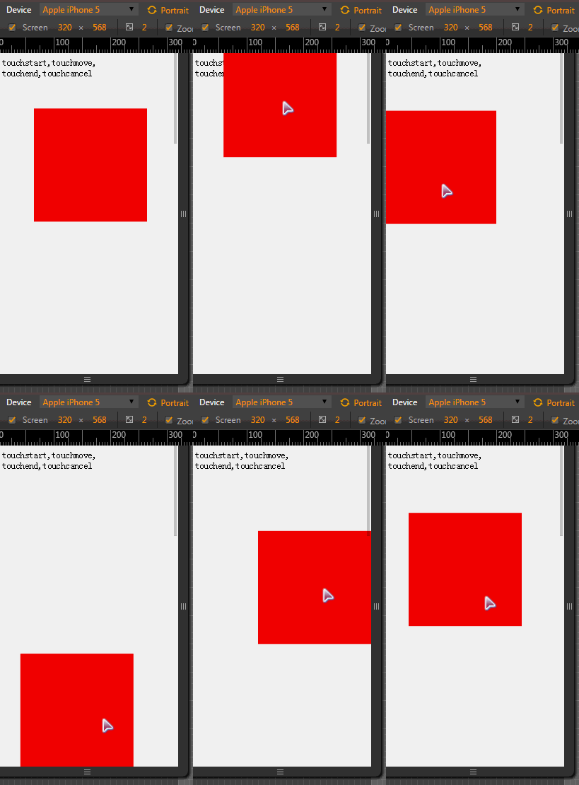
具体实现代码如下:
<!DOCTYPE html>
<html>
 <head>
 <meta charset="utf-8">
 <title></title>
 <meta name="viewport" content="width=device-width, user-scalable=no, initial-scale=1.0, maximum-scale=1.0, minimum-scale=1.0" />
 <style>
  body {
  height: 2000px;
  }
  #block {
  width:200px;
  height:200px;
  background-color: red;
  position: absolute;
  left: 0;
  top: 0;
  }
 </style>
 </head>
 <body>
 <div>
  touchstart,touchmove,
  touchend,touchcancel
 </div>
 <div id="block"></div>
<script>
 // 获取节点
 var block = document.getElementById("block");
 var oW,oH;
 // 绑定touchstart事件
 block.addEventListener("touchstart", function(e) {
  console.log(e);
  var touches = e.touches[0];
  oW = touches.clientX - block.offsetLeft;
  oH = touches.clientY - block.offsetTop;
  //阻止页面的滑动默认事件
  document.addEventListener("touchmove",defaultEvent,false);
 },false)

 block.addEventListener("touchmove", function(e) {
  var touches = e.touches[0];
  var oLeft = touches.clientX - oW;
  var oTop = touches.clientY - oH;
  if(oLeft < 0) {
  oLeft = 0;
  }else if(oLeft > document.documentElement.clientWidth - block.offsetWidth) {
  oLeft = (document.documentElement.clientWidth - block.offsetWidth);
  }
  block.style.left = oLeft + "px";
  block.style.top = oTop + "px";
 },false);

 block.addEventListener("touchend",function() {
  document.removeEventListener("touchmove",defaultEvent,false);
 },false);
 function defaultEvent(e) {
  e.preventDefault();
 }
</script>
 </body>
</html>
以上就是本文的全部内容,希望对各位开发者在学习JavaScript程序设计时提供有益参考。