

本文介绍如何在Vue项目中封装自定义Switch开关组件,实现样式定制与双向数据绑定。通过示例演示父组件调用方法及change事件处理,并补充监控el-switch控件值变化的技巧,解决系统消息推送范围与人员标签显示的联动需求。
封装自定义Switch组件
原项目使用Element UI,但因Switch开关样式不符合设计要求,因此手动封装了一个Switch组件,并实现了该开关的双向数据绑定功能。
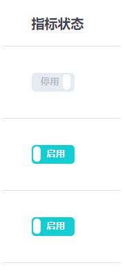
<template>
<label role="checkbox" :class="['switch', { toggled }]">
<input type="checkbox" class="switch-input" @change="toggle" />
<div
class="switch-core"
:style="{ backgroundColor: toggled ? colorChecked : colorUnchecked }"
>
<div
class="switch-button"
:style="{
transition: `transform ${speed}ms`,
transform: toggled ? null : `translate3d(32px, 0px, 0px)`
}"
></div>
</div>
<span class="switch-label label-right" v-if="toggled" v-html="labelChecked">
</span>
<span class="switch-label label-left" v-html="labelUnchecked" v-else>
</span>
</label>
</template>
<script>
export default {
 name: "ToggleSwitch",
 data() {
  return {
   toggled: this.value
  };
 },
 props: {
  value: {
   type: Boolean,
   default: true
  },
  speed: {
   type: Number,
   default: 100
  },
  labelChecked: {
   type: String,
   default: "启用"
  },
  labelUnchecked: {
   type: String,
   default: "停用"
  },
  colorChecked: {
   type: String,
   default: "#11CED2"
  },
  colorUnchecked: {
   type: String,
   default: "#E6EAF1"
  }
 },
 watch: {
  value: function(val) {
   this.value = val;
  }
 },
 methods: {
  toggle(event) {
   this.toggled = !this.toggled;
   this.$emit("update:value", this.toggled);
   this.$emit("change", event);
  }
 }
};
</script>
<style lang="scss" scoped>
.switch {
 display: inline-block;
 position: relative;
 overflow: hidden;
 vertical-align: middle;
 user-select: none;
 font-size: 10px;
 cursor: pointer;

 .switch-input {
  display: none;
 }

 .switch-label {
  position: absolute;
  top: 0;
  font-weight: 600;
  color: white;

  z-index: 2;

  &.label-left {
   left: 10px;
   line-height: 20px;
   border-top-left-radius: 2px;
   border-bottom-left-radius: 2px;
   color: #b5bdc8;
  }

  &.label-right {
   right: 10px;
   line-height: 20px;
   border-top-right-radius: 2px;
   border-bottom-right-radius: 2px;
  }
 }

 .switch-core {
  display: block;
  position: relative;
  box-sizing: border-box;
  outline: 0;
  margin: 0;
  transition: border-color 0.3s, background-color 0.3s;
  user-select: none;
  width: 46px;
  height: 20px;
  border-radius: 4px;
  line-height: 20px;

  .switch-button {
   width: 8px;
   height: 16px;
   display: block;
   position: absolute;
   overflow: hidden;
   top: 2;
   left: 2;
   z-index: 3;
   transform: translate3d(0, 0, 0);
   background-color: rgba(255, 255, 255, 1);
   border-radius: 4px;
   margin-top: 2px;
   margin-left: 2px;
  }
 }
}
</style>
父组件调用与事件处理
在父组件中调用封装好的开关组件。
<toggle-switch
       v-model="value"
       :value.sync="value"
       @change="switchChange"
      >
      </toggle-switch>
该组件已实现Switch开关的双向数据绑定。在父组件的methods中定义一个@change事件以处理状态变更。
switchChange() {
   console.log("switch值改变");
  },
监控el-switch值变化
补充知识:Vue中监控el-switch控件值变化的方法。
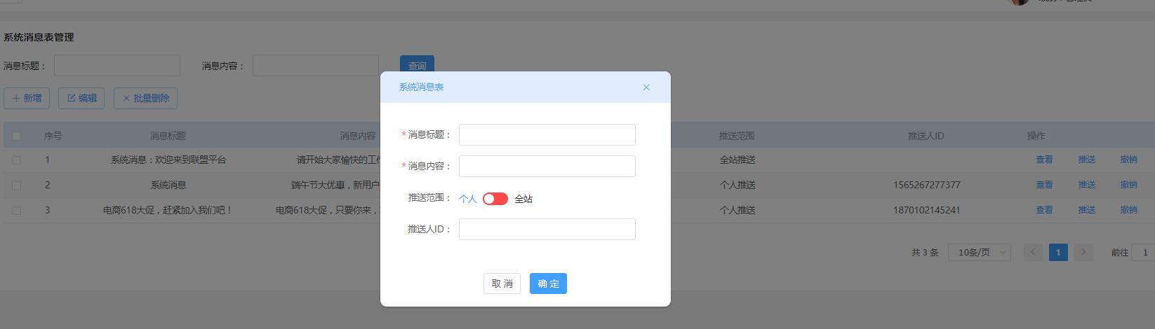
需求效果是根据系统消息的推送范围来决定是否显示推送人标签,具体分为两种情况:
第一种情况:选择全站推送。
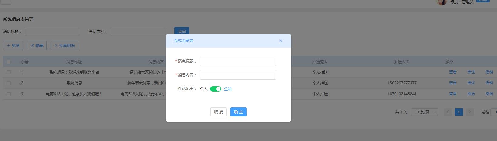
第二种情况:选择个人推送。
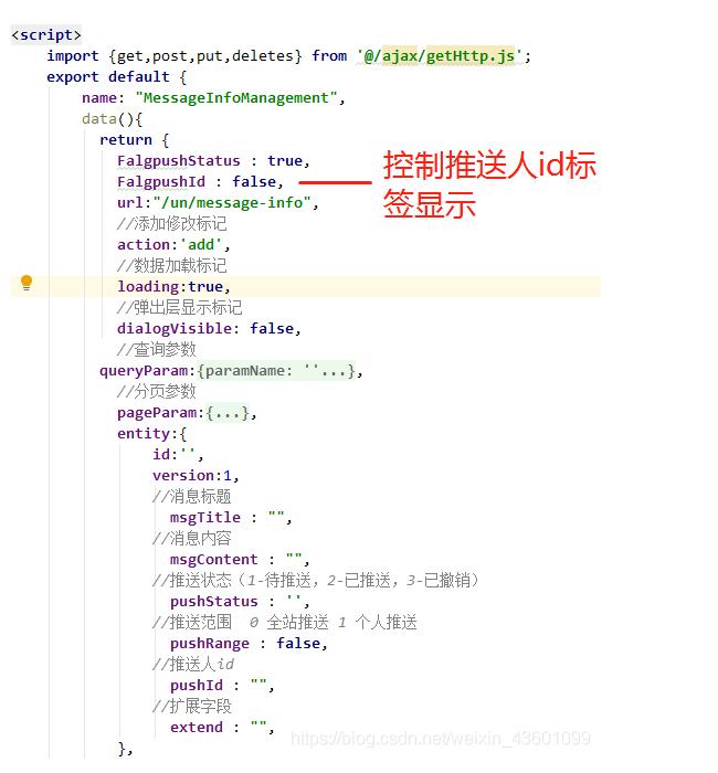
页面定义的data对象结构如下。
el-switch标签控件代码中,v-model="entity.pushRange"绑定的是推送范围字段。
 <el-form-item label="推送范围:" :label-width="formLabelWidth" prop="pushRange">
    <el-switch
     v-model="entity.pushRange"
     active-color="#13ce66"
     inactive-color="#ff4949"
     active-text="全站"
     inactive-text="个人"
     @change="parens2($event)">
    </el-switch>
 </el-form-item>
下方的推送人ID文本框通过v-if="FalgpushId"控制显示,当值为false时隐藏,true时显示(默认值为初始化时定义的FalgpushId = false,因此初始状态为隐藏)。
 <!-- 推送人id -->
 <el-form-item label="推送人ID:" :label-width="formLabelWidth" prop="pushId" v-if="FalgpushId">
   <el-input v-model="entity.pushId" :disabled="disabled" clearable></el-input>
 </el-form-item>
methods中的方法通过$event参数来监控该控件值的变化。
 methods:{

  //该方法传入推送范围值,根据判断,决定是否展示其下面的推送人ID文本框
     parens2(value){
      let self = this ;
      if(value == false){
       //el-switch控件为 个人推送时,value为false
       self.FalgpushId = true;   //推送人id文本框显示
       self.entity.pushRange = false;
      }else if(value == true){
       //el-switch控件为 true 全站推送,value为true
       self.FalgpushId = false;   //推送人id文本框隐藏
       self.entity.pushRange = true;
      }
     },
 }
以上关于Vue.js封装Switch开关组件的操作即为全部内容,希望能提供参考,感谢支持。