

本文详细介绍如何使用纯JavaScript结合CSS样式实现一个动态在线时钟。核心要点包括利用transform-origin控制旋转中心、批量处理HTML元素与样式,以及优化时针、分针和秒针的位置逻辑。文中还展示了通过绝对定位与transform属性实现元素居中的具体方法,并提供完整代码供参考。
纯JS与CSS实现动态在线时钟
本文分享了一段使用JavaScript和CSS实现在线时钟的完整代码示例,供读者参考学习。
<!DOCTYPE html>
<html>
 <head>
 <meta charset="utf-8">
 <title>时钟</title>
 <style type="text/css">
 *{
 padding: 0;
 margin: 0;
 }
 .wrap{
 position: absolute;
 width: 200px;
 height: 200px;
 border: 2px solid;
 background-color: pink;
 border-radius: 50%;
 left: 50%;
 top: 50%;
 transform: translate(-50%,-50%);
 }
 .wrap>ul{
 list-style: none;
 }
 .wrap>ul>li{
 position: absolute;
 left: 99px;
 top: 0;
 width: 2px;
 height: 10px;
 background-color: black;
 transform-origin: center 100px;
 }
 .wrap>ul>li:nth-child(5n+1){
 height: 15px;
 }
 .wrap > .hour{
 position: absolute;
 left: 97px;
 top:70px ;
 width: 6px;
 height: 30px;
 background: black;
 transform-origin: center bottom;
 }
 .wrap > .min{
 position: absolute;
 left: 98px;
 top: 50px;
 width: 4px;
 height: 50px;
 background: gray;
 transform-origin: center bottom;
 }
 .wrap > .sec{
 position: absolute;
 left: 99px;
 top: 30px;
 width: 2px;
 height: 70px;
 background: red;
 transform-origin: center bottom;
 }
 .wrap > .center{
 position: absolute;
 left: 90px;
 top: 90px;
 width: 20px;
 height: 20px;
 border-radius:50% ;
 background: black;
 }
 </style>
 </head>
 <body>
 <div class="wrap">
 <ul></ul>
 <div class="hour"></div>
 <div class="min"></div>
 <div class="sec"></div>
 <div class="center"></div>
 </div>
 </body>
 <script type="text/javascript">
 window.onload =function(){
 var hourNode =document.querySelector(".wrap > .hour");
 var minNode =document.querySelector(".wrap > .min");
 var secNode =document.querySelector(".wrap > .sec");
 var ulNode =document.querySelector(".wrap>ul");
 var styleNode =document.createElement('style');
 var liHtml ='';
 var styleHtml ='';
 for(var i=0;i<60;i++){
 liHtml += "<li></li>";
 styleHtml+=".wrap>ul>li:nth-child("+(i+1)+"){transform: rotate("+(i*6)+"deg);}"
 }
 ulNode.innerHTML =liHtml;
 styleNode.innerHTML =styleHtml;
 document.querySelector('head').appendChild(styleNode);

 moveTime();
 setInterval(moveTime,1000);

 function moveTime(){
 var date =new Date();
 var sec =date.getSeconds();
 var min =date.getMinutes()+sec/60;
 var hour =date.getHours()+min/60;
 hourNode.style.transform ="rotate("+(hour*30)+"deg)";
 minNode.style.transform ="rotate("+(min*6)+"deg)";
 secNode.style.transform ="rotate("+(sec*6)+"deg)";
 }

 }
 </script>
</html>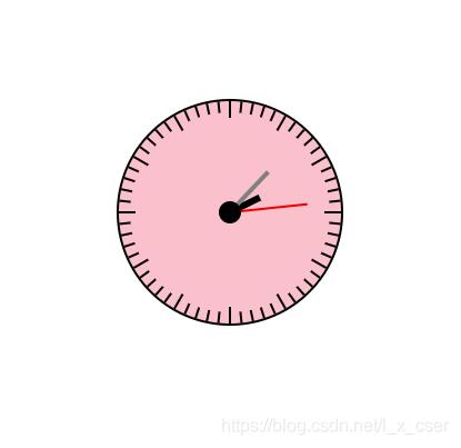
实现要点
主要涉及以下技术点: 1. 应用transform-origin属性控制旋转基点。 2. 批量处理HTML元素及其样式信息。 3. 优化指针位置逻辑,确保时针与小时数关联、分针与分钟数关联,并处理秒针与分针的联动关系。
新增一种居中方案:
通过设置绝对定位left:50%和top:50%,并结合transform:translate(-50%,-50%)实现元素居中。
如需查看更多JavaScript时钟特效,请点击查看相关专题。
以上就是本文的全部内容,希望能为读者的学习提供有益帮助,欢迎继续支持本站。