

本文介绍如何在ECharts中处理月度数据缺失问题。通过获取当月总天数,利用Linq库遍历日期,对比后端返回数据,对缺失日期自动填充0值。确保折线图x轴日期连续且数据完整,提升图表直观性与准确性。
需求背景:在查询月度数据时,后端接口往往只返回有数值的记录,导致部分天数的数据缺失。为了在前端展示完整的月度趋势,需要由前端介入处理,将后端未传输的日期数据补充为0,从而实现月度数据的完整性展示。
1. 错误展示
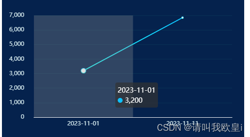
若后端未传输数值为0的数据,前端直接渲染会导致折线图中缺失部分月份的数据点,使得图表显示不完整,无法直观反映整个月的数据变化趋势。
  // 模拟后端数据
            let result = [
                {
                    date: '2023-11-01',
                    value: 3200
                },
                {
                    date: '2023-11-11',
                    value: 6850
                }
            ];
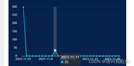
2. 正确效果
3. 代码讲解
3.1 思路
默认情况下,请求后端接口获取的是当月的数据,请求参数格式通常为“年-月”,例如 2024-03。
    var date = new Date();
    const year = date.getFullYear();
    const month = date.getMonth() + 1;
    this.monthFlow = `${year}-${month}`;
首先需要获取当月包含的总天数。如果需要获取其他特定月份的天数,可以通过实例化 Date 对象实现,例如 var today = new Date('2023-12')。
            // 得到这个月的总天数
            var lastDay = new Date(year, month + 1, 0).getDate();
            console.log(lastDay, '当月的天数');
接着,使用 Linq 插件来实现数据处理逻辑。需要先在项目中下载该插件,并在页面中导入使用。
//下载
npm install linq
//导入
import Linq from "linq";
通过 for 循环遍历当月的每一天。在循环中判断日期字符串(如 2024-01-23)中的日部分是否等于当前循环的天数。如果相等,则从后端数据中获取对应值进行填充;如果不相等,说明该日无数据,则自动补 0。最终通过 sendMonthOption 变量接收处理后的数据,该日期可以是动态的,根据实际业务数据进行调整。
    for (var i = 1; i <= lastDay; i++) {
                //  new Date(x.date).getDate()获取到数据的日期,如果为01,则为1,并且是数字类型
                let count = Linq.from(result)
                    .where((x) => new Date(x.date).getDate() == i)
                    .toArray();
                if (count.length > 0) {
                    this.sendMonthOption.xAxis.push(count[0].date);
                    this.sendMonthOption.seriesData.push(count[0].value);
                } else {
                    this.sendMonthOption.xAxis.push(`2023-11-${i}`);
                    this.sendMonthOption.seriesData.push(0);
                }
            }
4. 完整代码
<template>
    <div id="month" ref="bin" style="width: 500px; height: 300px; margin-top: 0.125rem"></div>
</template>
<script>
import * as echarts from 'echarts';
import Linq from 'linq';
export default {
    data() {
        return {
            sendMonthOption: {
                xAxis: [],
                seriesData: []
            }
        };
    },
    mounted() {
        this.play_echarts();
    },
    methods: {
        play_echarts() {
            // 假如是当月的数据查询
            var today = new Date();
            // 获取到年月
            var year = today.getFullYear();
            var month = today.getMonth();
            // 得到这个月的总天数
            var lastDay = new Date(year, month + 1, 0).getDate();
            console.log(lastDay, '当月的天数');
            // 模拟后端数据
            let result = [
                {
                    date: '2023-11-01',
                    value: 299
                },
                {
                    date: '2023-11-11',
                    value: 35
                }
            ];
            for (var i = 1; i <= lastDay; i++) {
                //  new Date(x.date).getDate()获取到数据的日期,如果为01,则为1,并且是数字类型
                let count = Linq.from(result)
                    .where((x) => new Date(x.date).getDate() == i)
                    .toArray();
                if (count.length > 0) {
                    this.sendMonthOption.xAxis.push(count[0].date);
                    this.sendMonthOption.seriesData.push(count[0].value);
                } else {
                    this.sendMonthOption.xAxis.push(`2023-11-${i}`);
                    this.sendMonthOption.seriesData.push(0);
                }
            }
            var pieChart = echarts.init(this.$refs.bin);
            var option = {
                backgroundColor: '#05224d',
                tooltip: {
                    trigger: 'axis',
                    axisPointer: {
                        type: 'shadow'
                    }
                },
                grid: {
                    top: '15%',
                    left: '3%',
                    right: '5%',
                    bottom: '8%',
                    containLabel: true
                },
                // 内置区域缩放
                //数据过多避免重叠
                xAxis: [
                    {
                        type: 'category',
                        boundaryGap: true,
                        axisLine: {
                            //坐标轴轴线相关设置。数学上的x轴
                            show: true,
                            lineStyle: {
                                color: '#f9f9f9'
                            }
                        },
                        axisLabel: {
                            //坐标轴刻度标签的相关设置
                            color: '#d1e6eb'
                            //   margin: 15,
                        },
                        axisTick: {
                            show: false
                        },
                        data: this.sendMonthOption.xAxis
                    }
                ],
                dataZoom: [
                    {
                        type: 'inside' // 使用滑动条型的 dataZoom
                    }
                ],
                yAxis: [
                    {
                        type: 'value',
                        min: 0,
                        // max: 140,
                        splitNumber: 7,
                        splitLine: {
                            show: true,
                            lineStyle: {
                                color: '#0a3256'
                            }
                        },
                        axisLine: {
                            show: false
                        },
                        axisLabel: {
                            margin: 20,
                            color: '#d1e6eb'
                        },
                        axisTick: {
                            show: false
                        }
                    }
                ],
                series: [
                    {
                        type: 'line',
                        itemStyle: {
                            color: new echarts.graphic.LinearGradient(0, 0, 0, 1, [
                                {
                                    offset: 0,
                                    color: '#0ec1ff'
                                },
                                {
                                    offset: 1,
                                    color: '#1cfffb'
                                }
                            ])
                        },
                        data: this.sendMonthOption.seriesData
                    }
                ]
            };
            // 使用刚指定的配置项和数据显示图表。true是为了实时更新数据
            pieChart.setOption(option, true);
            window.addEventListener('resize', function () {
                pieChart.resize();
            });
            //   pieChart.on(
            //     "touchmove",
            //     function (e) {
            //       e.preventDefault();
            //     },
            //     { passive: false }
            //   );
        }
    }
};
</script>
<style lang="scss" scoped></style>
到此这篇关于echarts折线图月份数据不足自动补0和日期达到数据连续的效果的文章就介绍到这了,更多相关echarts折线图内容请搜索本站以前的文章或继续浏览下面的相关文章希望大家以后多多支持本站!