

本文记录使用JavaScript实现瀑布流布局时遇到的窗口大小改变无法自适应及缩放后布局错乱问题。通过监听window.onresize事件并配合setTimeout延迟执行,实现窗口缩放时的重新布局。针对放大窗口后底部列无法复位的问题,在waterfall函数中增加aBox[i].style.cssText =''以清除残留样式,从而修复BUG并实现完整的自适应效果。
JavaScript实现瀑布流自适应:解决窗口缩放布局错乱问题
近日跟随Amy老师的教程,使用JavaScript编写了瀑布流布局代码。在测试中发现,初始加载时布局能正常适应屏幕宽度,但当用户手动调整浏览器窗口大小时,页面内容无法自动重新排列,导致布局失效。
为解决这一问题,考虑利用window.onresize事件监听窗口尺寸变化,并在触发时重新调用瀑布流函数,以实现布局的自适应刷新。
具体实现代码如下:
window.onload=function(){
//瀑布流函数
waterfall('content','box');
//模拟数据加载
var dataInt = {"data":[{"src":"01.jpg"},{"src":"02.jpg"},{"src":"03.jpg"},{"src":"04.jpg"},{"src":"05.jpg"},{"src":"06.jpg"},{"src":"07.jpg"}]}
//当屏幕大小改变时从新执行瀑布流函数 达到从新适应的作用
window.onresize=function(){
// waterfall('content','box');
setTimeout(function() {waterfall('content','box');}, 200);
    }
window.onscroll=function(){
if(checkScroll()){
var oparent = document.getElementById('content');
//将熏染的数据添加入html中
for(var i=0;i<dataInt.data.length;i++){
var obox = document.createElement("div");
obox.className = "box";
oparent.appendChild(obox);
var opic = document.createElement("div");
opic.className = "pic";
obox.appendChild(opic);
var oImg = document.createElement("img");
oImg.src="img/"+dataInt.data[i].src;
opic.appendChild(oImg);
            }
waterfall('content','box');
        }
    }
}
当屏幕缩小时是可以的,但是从缩小的放大就出现了BUG
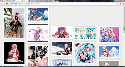
看没看到后面几列的顶部回不来了, 于是我打开开发工具看是怎么回事,
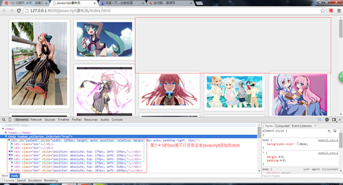
第3 4 5个div中不应该有style,是因为缩小的时候给他添加上去的,而放大了他没有清除所以保留下来了就会出现这个样子于是:我在瀑布流函数里加了句aBox[i].style.cssText ='';使得每次进来都清空style
代码如下:
function waterfall(parent,box){
//将content下所有class box取出来
var aParent = document.getElementById(parent);
var aBox = getBclass(aParent,box);
//获取盒子的宽度
var aBoxW = aBox[0].offsetWidth;
//用浏览器的可是宽度除以box宽度 得到列数
var cols = Math.floor(document.documentElement.clientWidth/aBoxW);
//设定 content的宽度 和居中
aParent.style.cssText = 'width:'+aBoxW*cols+'px;height:auto;position: relative; margin:0 auto;padding-right:15px';
//创建每一列的高度数组
var hArr=[];
for(var i=0; i<aBox.length;i++){
aBox[i].style.cssText ='';
if(i<cols){
hArr.push(aBox[i].offsetHeight);
}else{
var minH = Math.min.apply(null,hArr);
var index = getMinIndex(hArr,minH); //找出高最矮的 索引值
//console.log(aBoxW);
aBox[i].style.position = 'absolute';
aBox[i].style.top = minH+'px';
aBox[i].style.left = aBoxW*index+'px';
hArr[index]+=aBox[i].offsetHeight;
        }
    }
}
这样就解决了缩小后回不来的BUG,可以正常自适应了
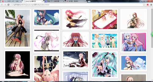
最后我把整个的javascript 贴出来
代码如下:
window.onload=function(){
//瀑布流函数
waterfall('content','box');
//模拟数据加载
var dataInt = {"data":[{"src":"01.jpg"},{"src":"02.jpg"},{"src":"03.jpg"},{"src":"04.jpg"},{"src":"05.jpg"},{"src":"06.jpg"},{"src":"07.jpg"}]}
//当屏幕大小改变时从新执行瀑布流函数 达到从新适应的作用
window.onresize=function(){
// waterfall('content','box');
setTimeout(function() {waterfall('content','box');}, 200);
    }
window.onscroll=function(){
if(checkScroll()){
var oparent = document.getElementById('content');
//将熏染的数据添加入html中
for(var i=0;i<dataInt.data.length;i++){
var obox = document.createElement("div");
obox.className = "box";
oparent.appendChild(obox);
var opic = document.createElement("div");
opic.className = "pic";
obox.appendChild(opic);
var oImg = document.createElement("img");
oImg.src="img/"+dataInt.data[i].src;
opic.appendChild(oImg);
            }
waterfall('content','box');
        }
    }

}
function waterfall(parent,box){
//将content下所有class box取出来
var aParent = document.getElementById(parent);
var aBox = getBclass(aParent,box);

//获取盒子的宽度
var aBoxW = aBox[0].offsetWidth;
//用浏览器的可是宽度除以box宽度 得到列数
var cols = Math.floor(document.documentElement.clientWidth/aBoxW);
//设定 content的宽度 和居中
aParent.style.cssText = 'width:'+aBoxW*cols+'px;height:auto;position: relative; margin:0 auto;padding-right:15px';
//创建每一列的高度数组
var hArr=[];
for(var i=0; i<aBox.length;i++){
aBox[i].style.cssText ='';
if(i<cols){
hArr.push(aBox[i].offsetHeight);
}else{
var minH = Math.min.apply(null,hArr);
var index = getMinIndex(hArr,minH); //找出高最矮的 索引值
//console.log(aBoxW);
aBox[i].style.position = 'absolute';
aBox[i].style.top = minH+'px';
aBox[i].style.left = aBoxW*index+'px';
hArr[index]+=aBox[i].offsetHeight;
        }
    }
}
//根据class获取到元素
function getBclass(parent,className){
var boxarr = new Array(); //用来存储获取到的class
//console.log(parent.prototype);
allElement=parent.getElementsByTagName('*');
for(var i=0;i<allElement.length;i++){
if(allElement[i].className == className){
boxarr.push(allElement[i]);
        }
    }
return boxarr;
}

//找出高最矮的 索引值
function getMinIndex(arr,value){
for(var i in arr){
if (arr[i]==value){
return i;
        }
    }
}
//建立一个检测轮轮滑动是否成立的函数 返回真假
function checkScroll(){
var oparent = document.getElementById("content");
var oBox = getBclass(oparent,'box');
var lastoBoxTop = oBox[oBox.length-1].offsetTop+Math.floor(oBox[oBox.length-1].offsetHeight/2);
//console.log(lastoBoxTop);
var scrollTop = document.body.scrollTop||document.documentElement.scrollTop;
var height = document.body.clientHeight||document.documentElement.clientHeight;
//console.log(scrollTop);
return(lastoBoxTop<scrollTop+height)?true:false;
}
css文件贴出来
代码如下:
*{margin: 0;padding: 0;}
body{background-color: #eee;}
.content{
position: relative;
    }
.box{
padding: 15px 0 0 15px;
float: left;
}
.pic{
padding: 10px;
border: 1px solid #ccc;
box-shadow: 0 0 5px #CCCCCC;
border-radius: 5px;
background: #fff;
}
.pic img{
width: 220px;
height: auto;
border: 1px solid #eee;
}
html文件贴出来
代码如下:
<!DOCTYPE html>
<html>
<head>
<meta charset="utf-8" />
<title>javascript瀑布流</title>
<link rel="stylesheet" type="text/css" href="css/pubuli.css"/>
<script type="text/javascript" src="js/my.js" ></script>
</head>
<body>
<div id="content">
<div class="box">
<div class="pic">
<img src="img/01.jpg"/>
</div>
</div>
<div class="box">
<div class="pic">
<img src="img/02.jpg"/>
</div>
</div>
<div class="box">
<div class="pic">
<img src="img/03.jpg"/>
</div>
</div>
<div class="box">
<div class="pic">
<img src="img/04.jpg"/>
</div>
</div>
<div class="box">
<div class="pic">
<img src="img/05.jpg"/>
</div>
</div>
<div class="box">
<div class="pic">
<img src="img/06.jpg"/>
</div>
</div>
<div class="box">
<div class="pic">
<img src="img/07.jpg"/>
</div>
</div>
<div class="box">
<div class="pic">
<img src="img/08.jpg"/>
</div>
</div>
<div class="box">
<div class="pic">
<img src="img/09.jpg"/>
</div>
</div>
<div class="box">
<div class="pic">
<img src="img/10.jpg"/>
</div>
</div>
<div class="box">
<div class="pic">
<img src="img/11.jpg"/>
</div>
</div>
<div class="box">
<div class="pic">
<img src="img/12.jpg"/>
</div>
</div>
<div class="box">
<div class="pic">
<img src="img/13.jpg"/>
</div>
</div>
<div class="box">
<div class="pic">
<img src="img/14.jpg"/>
</div>
</div>
<div class="box">
<div class="pic">
<img src="img/15.jpg"/>
</div>
</div>
<div class="box">
<div class="pic">
<img src="img/16.jpg"/>
</div>
</div>
<div class="box">
<div class="pic">
<img src="img/17.jpg"/>
</div>
</div>
<div class="box">
<div class="pic">
<img src="img/18.jpg"/>
</div>
</div>
<div class="box">
<div class="pic">
<img src="img/19.jpg"/>
</div>
</div>
<div class="box">
<div class="pic">
<img src="img/20.jpg"/>
</div>
</div>
<div class="box">
<div class="pic">
<img src="img/21.jpg"/>
</div>
</div>
<div class="box">
<div class="pic">
<img src="img/22.jpg"/>
</div>
</div>
</div>

</body>
</html>
好了谢谢大家观看,以前没写过技术分享类文章,有很多不周到的地方希望大家能多多指正。学习前端的小菜鸟敬上Y(^_^)Y