

本文详细解析ECharts中setOption的核心配置项,涵盖title标题、tooltip提示框、grid网格布局、legend图例、xAxis/yAxis坐标轴及series系列数据。通过具体代码示例展示如何自定义折线图样式、处理标签溢出及实现X轴文字动态换行与格式化,帮助开发者快速掌握图表定制技巧。
前言
本文主要介绍在使用ECharts进行图表开发时,setOption方法中涉及的常用属性配置及常见问题的解决方案。文中所列参数均源自实际项目经验,所有配置代码均放置在 setOption({ }) 中。
折线图
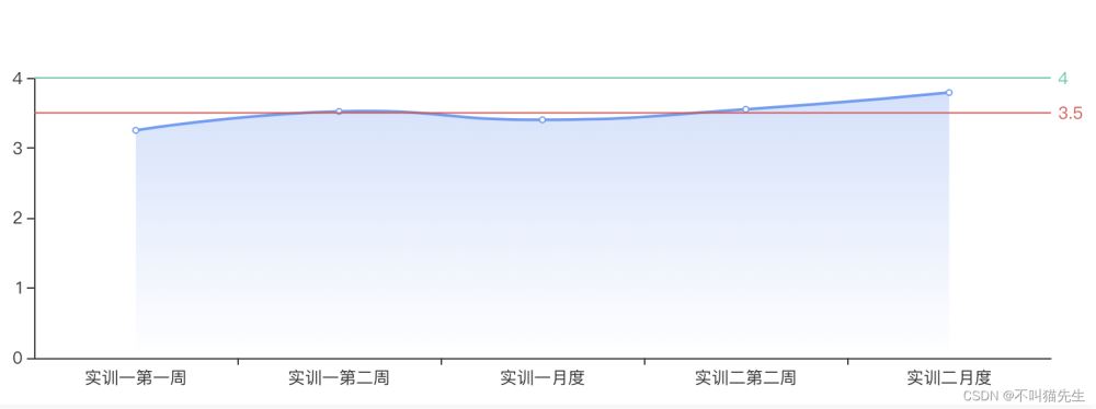
图示:
1.title
title:用于设置图表的标题。
- text:定义标题的具体名称文本。
- left:设置标题的水平定位方向。
- top、left:用于精确控制标题在图表中的定位坐标。
- textStyle:标题样式
- color:设置标题文字的颜色。
   title: {
        text: '答辩评分趋势',
        left: 'left',
        top: 20,
        left: 20,
        textStyle: {
            color: '#679CF6'
             }
       }
2.tooltip
tooltip:用于配置鼠标悬停时的提示框行为。
- trigger:定义触发类型,可选 'axis'(鼠标触及坐标轴时触发)或 'item'(鼠标触及折线数据点时触发)。
- showDelay:设置提示框显示的延迟时间(单位毫秒),旨在避免鼠标快速移动时提示框频繁闪烁切换。
- axisPointer:配置坐标轴指示器,仅在 trigger 为坐标轴触发时有效。
- type:指示器类型,可选 'line'(默认直线)或 'shadow'(设置 shadow 时鼠标悬停区域显示阴影)。
- shadowStyle:当 type 设置为 'shadow' 时,用于定义阴影的具体样式。
   tooltip: {
             trigger: 'axis',
             // 显示延迟,添加显示延迟可以避免频繁切换,单位ms
             showDelay: 200,
             // 坐标轴指示器,坐标轴触发有效
             axisPointer: {
                  // 默认为直线,可选为:'line' | 'shadow'
                  type: 'show',
                  shadowStyle: {
                          shadowBlur: 1,
                          opacity: 0.3
                              }
                     },
           },
3.grid
grid:用于设置图表主体距离容器边缘的位置及尺寸。
 grid: {
          left: '4%',
          right: '4%',
          bottom: '4%',
          top: '30%',
          containLabel: true
     },
- 当 containLabel 为 false 时: grid.left、grid.right、grid.top、grid.bottom、grid.width 和 grid.height 决定的是由坐标轴形成的矩形区域的尺寸和位置。
- 当 containLabel 为 true 时: grid.left、grid.right、grid.top、grid.bottom、grid.width 和 grid.height 决定的是包含了坐标轴标签在内的所有内容所形成的矩形位置。
- 此配置常用于防止标签溢出的场景,即当标签长度动态变化时,避免其溢出容器或覆盖其他组件。
4.legend
legend:用于配置图表的图例组件。
- data:定义图例中显示的具体文字内容。
- textStyle:设置图例文字的文字样式。
- icon:设置图例图标的形状,可选值包括 circle、rect、roundRect、triangle、diamond、pin、arrow 和 none。
  legend: {
         data: ['xx', 'xx', 'xx', 'xx'],
         right: '33%',
         top: '10%',
         textStyle: {
                 fontSize: 12,
                 color: '#666'
        },
           icon: "circle",
           itemWidth: 10,  // 设置宽度
           itemHeight: 10, // 设置高度
           itemGap: 40 // 设置间距
     },
5.xAxis
xAxis:用于配置X轴的相关属性。
- name:定义X轴的单位名称。
- splitLine:网格线
- show:设置为 false 时可隐藏网格线。
- data:指定X轴坐标轴上显示的数据,类型为数组。
- axisLine:设置x轴的轴线
- show:设置为 true 时显示坐标轴。
- lineStyle:设置轴线的样式
- color:设置坐标轴的颜色。
- width:设置坐标轴的宽度。
- type:定义线条的类型。
- axisLabel:用于设置X轴标签的文字样式。 - textStyle:文字样式对象。 - show:控制是否展示标签。 - fontSize:设置字体大小。 - color:设置文字颜色。 - formatter:自定义标签显示内容,接收一个函数作为参数,默认传入x坐标的值。
	xAxis: {
		type: "value",
			// x轴的名字,可以理解成单位
			name: "单位(K)",
				nameTextStyle: {
			// x轴的名字的样式相关
			color: "#BFBFBF",
				nameLocation: "start",
                    },
		splitLine: {
			//去除网格线
			show: false,
                    },
		//去除网格区域,否则会有一片区域
		splitArea: { show: false },
		data: [0, 5000, 10000, 15000, 20000, 25000, 30000, 35000],
			axisLine: {
			// 把x轴从实线变成虚线
			show: true,
				lineStyle: {
				// 设置x轴线条样式的颜色
				color: "#BDBDBD",
					width: 1,
						type: "solid",
                        },
		},
		axisLabel: {
			formatter: function (value) {
				return value >= 5000 ? parseInt(value / 1000) + "K" : value;
			},
			scale: true, // 设置数据自动缩放
        }
	},
6.yAxis
- yAxis:配置Y轴,其基本设置逻辑与xAxis类似。
7.series
series:定义图表系列,类型为对象。
- type:设置图表类型,如 'line' 表示折线图。
- smooth:设置为 true 可使折线呈现平滑曲线效果。
- name:定义该系列图例中显示的名称。
- areaStyle:设置折线下方填充区域的样式,示例中使用了渐变色。
- data:定义该系列的具体数据值。
- markLine:用于添加基线(参考线)。
- symbol:设置为 'none' 可隐藏基线上的箭头标记。
- lable:基线的文字设置
- position:设置基线标签文字的位置,可选 'start'、'middle' 或 'end'。
- show:控制是否显示基线标签文字。
- formatter:定义基线标签显示的具体内容。
- data:设置基线(Array类型)
- silent:控制鼠标悬停时的交互行为,可选 true 或 false。
- lineStyle:基线线条设置,对象类型
- type:设置基线线条的样式,如 'solid'。
- color:设置基线线条的颜色。
- yAxis:指定Y轴上基线的数值位置。
 series: [
                    {
                        data: this.trendLineData.map(item => item.defenceScore),
                        type: 'line',
                        smooth: true,
                        name: "答辩评分",
                        areaStyle: {
                            normal: {
                                opacity: 0.3,
                                color: new this.$echarts.graphic.LinearGradient(0, 0, 0, 1, [{
                                    offset: 0,
                                    color: '#679CF6'
                                }, {
                                    offset: 1,
                                    color: '#fff'
                                }])
                            }
                        },
                        // 基线设置
                        markLine: {
                            symbol: "none",
                            data: [{
                                silent: false,
                                lineStyle: {
                                    type: "solid",
                                    color: "#E34949",
                                },
                                yAxis: 3.5
                            },
                            {
                                silent: false,
                                lineStyle: {
                                    type: "solid",
                                    color: "#3BC9A9",
                                },
                                yAxis: 4
                            }
                            ]
                        }
                    },
                ],
附:常见问题
1、自定义X轴文字(文字替换)
   axisLabel: {
        formatter: function (value) {
              return value >= 5000 ? parseInt(value / 1000) + "K" : value;
           },
     scale: true, // 设置数据自动缩放,要不然数据多的话就堆一块了
   }
2、自定义X轴文字(文字换行)
其中 this.trendLineData 代表后端返回的数据,主要演示如何动态实现X轴类目项文字的智能换行。
 		formatter: (value) => {
			if (this.trendLineData.length > 2) {
			    //拼接加\n返回的类目项
				var ret = "";
				//每项显示文字个数
				var maxLength = 12;
				//X轴类目项的文字个数
				var valLength = value.length;
				//类目项需要换行的行数
				var rowN = Math.ceil(valLength / maxLength);
				if (rowN > 1)
				{
					for (var i = 0; i < rowN; i++) {
					    //每次截取的字符串
						var temp = "";
						//开始截取的位置
						var start = i * maxLength;
						//结束截取的位置
						var end = start + maxLength;
						//这里也可以加一个是否是最后一行的判断
						temp = value.substring(start, end) + "\n";
						//拼接最终的字符串
						ret += temp;
					}
					return ret;
				}
				else {
					return value;
				}
			} else {
				return value;
			}
		}
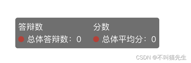
3、自定义tooltip
	tooltip: {
		    trigger: 'axis',
		    // 显示延迟,添加显示延迟可以避免频繁切换,单位ms
			showDelay: 200,
			 // 坐标轴指示器,坐标轴触发有效
			axisPointer: {
			    // 默认为直线,可选为:'line' | 'shadow'
		     	type: 'shadow',
				shadowStyle: {
				shadowBlur: 1,
					opacity: 0.3
			    }
	     	},
		formatter: function (data) {
			var res = "<div style='display:flex;'>";
			res += "<div class='left' >"
			res += '答辩数' + '</br>'
			data.forEach(item => {
				item.value = item.value ? item.value : 0;
				if (item.seriesType == 'bar') {
					res += item.marker + item.seriesName + '答辩数' + ':' + item.value + '</br>';
				}
			});
			res += " </div>"
			res += "<div class='right' style='margin-left:20px'>"
			res += '分数' + '</br>'
			data.forEach(item => {
				item.value = item.value ? item.value : 0;
				if (item.seriesType == 'line') {
					res += item.marker + item.seriesName + (item.seriesName == '总体' ? '平均分' : '分数') + ':' + item.value + '</br>';
				}
			});
			res += " </div>"
			res += " </div>"
			return res
		}
	},
最终效果如图所示:
总结
至此,关于ECharts常用参数总结及参数自定义的内容介绍完毕。如需了解更多相关技巧,请查阅本站往期文章或继续浏览后续内容。