

本文介绍如何利用JS和SVG实现一款创意十足的拉杆式验证码交互效果。通过CSS3动画控制拉杆部件,结合Canvas绘制数字条带,并引入anime.js库实现数字滚动与缓动停止,还原了类似抽奖的获取验证码体验。
介绍
此前在短视频平台看到一种极具创意的产品构思,其后端逻辑让开发者头疼,前端实现让设计师抓狂,属于那种“阴间”交互风格。其中有一个脑洞大开的设想:用户通过拉动类似抽奖的拉杆来获取验证码。本期内容旨在还原这一交互效果,探讨其实现细节与疯狂之处。
演示
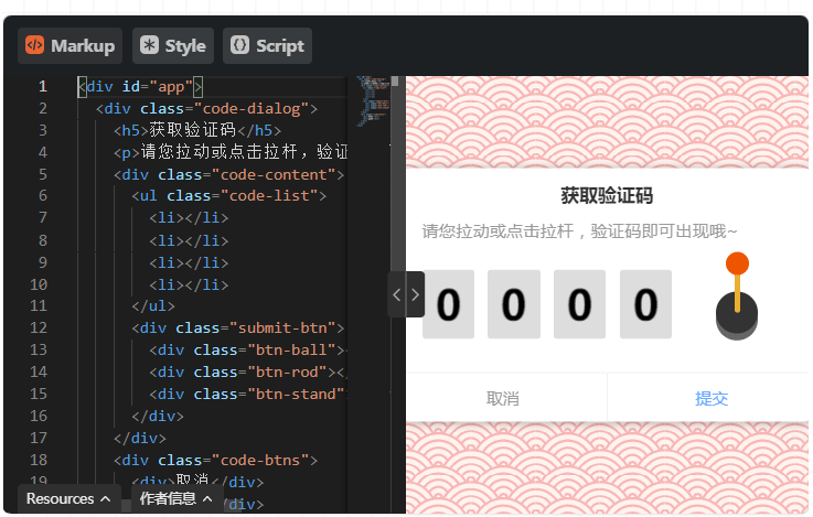
最终呈现的效果如下图所示。
Markup
<div id="app">
  <div class="code-dialog">
    <h5>获取验证码</h5>
    <p>请您拉动或点击拉杆,验证码即可出现哦~</p>
    <div class="code-content">
      <ul class="code-list">
        <li></li>
        <li></li>
        <li></li>
        <li></li>
      </ul>
      <div class="submit-btn">
        <div class="btn-ball"></div>
        <div class="btn-rod"></div>
        <div class="btn-stand"></div>
      </div>
    </div>
    <div class="code-btns">
      <div>取消</div>
      <div>提交</div>
    </div>
  </div>
</div>
style
@import url("https://fonts.googleapis.com/css?family=Baloo+Bhaijaan&display=swap");
* {
  -webkit-tap-highlight-color: transparent !important;
}
#app{
  width:100%;
  height: 100vh;
  position: relative;
  overflow: hidden;
  background-color: #fff3ef;
  background-image: url("data:image/svg+xml,%3Csvg xmlns='http://www.w3.org/2000/svg' viewBox='0 0 56 28' width='56' height='28'%3E%3Cpath fill='%23ed5c5c' fill-opacity='0.4' d='M56 26v2h-7.75c2.3-1.27 4.94-2 7.75-2zm-26 2a2 2 0 1 0-4 0h-4.09A25.98 25.98 0 0 0 0 16v-2c.67 0 1.34.02 2 .07V14a2 2 0 0 0-2-2v-2a4 4 0 0 1 3.98 3.6 28.09 28.09 0 0 1 2.8-3.86A8 8 0 0 0 0 6V4a9.99 9.99 0 0 1 8.17 4.23c.94-.95 1.96-1.83 3.03-2.63A13.98 13.98 0 0 0 0 0h7.75c2 1.1 3.73 2.63 5.1 4.45 1.12-.72 2.3-1.37 3.53-1.93A20.1 20.1 0 0 0 14.28 0h2.7c.45.56.88 1.14 1.29 1.74 1.3-.48 2.63-.87 4-1.15-.11-.2-.23-.4-.36-.59H26v.07a28.4 28.4 0 0 1 4 0V0h4.09l-.37.59c1.38.28 2.72.67 4.01 1.15.4-.6.84-1.18 1.3-1.74h2.69a20.1 20.1 0 0 0-2.1 2.52c1.23.56 2.41 1.2 3.54 1.93A16.08 16.08 0 0 1 48.25 0H56c-4.58 0-8.65 2.2-11.2 5.6 1.07.8 2.09 1.68 3.03 2.63A9.99 9.99 0 0 1 56 4v2a8 8 0 0 0-6.77 3.74c1.03 1.2 1.97 2.5 2.79 3.86A4 4 0 0 1 56 10v2a2 2 0 0 0-2 2.07 28.4 28.4 0 0 1 2-.07v2c-9.2 0-17.3 4.78-21.91 12H30zM7.75 28H0v-2c2.81 0 5.46.73 7.75 2zM56 20v2c-5.6 0-10.65 2.3-14.28 6h-2.7c4.04-4.89 10.15-8 16.98-8zm-39.03 8h-2.69C10.65 24.3 5.6 22 0 22v-2c6.83 0 12.94 3.11 16.97 8zm15.01-.4a28.09 28.09 0 0 1 2.8-3.86 8 8 0 0 0-13.55 0c1.03 1.2 1.97 2.5 2.79 3.86a4 4 0 0 1 7.96 0zm14.29-11.86c1.3-.48 2.63-.87 4-1.15a25.99 25.99 0 0 0-44.55 0c1.38.28 2.72.67 4.01 1.15a21.98 21.98 0 0 1 36.54 0zm-5.43 2.71c1.13-.72 2.3-1.37 3.54-1.93a19.98 19.98 0 0 0-32.76 0c1.23.56 2.41 1.2 3.54 1.93a15.98 15.98 0 0 1 25.68 0zm-4.67 3.78c.94-.95 1.96-1.83 3.03-2.63a13.98 13.98 0 0 0-22.4 0c1.07.8 2.09 1.68 3.03 2.63a9.99 9.99 0 0 1 16.34 0z'%3E%3C/path%3E%3C/svg%3E");
}
.code-dialog{
  width:360px;
  height:220px;
  background:#ffffff;
  position:absolute;
  top: 50%;
  left: 50%;
  transform: translate(-50%,-50%);
  border-radius: 10px;
  box-shadow: 1px 1px 8px rgba(0,0,0,.3);
  box-sizing: border-box;
  padding: 15px 20px 42px;
  h5{
    text-align: center;
    font-size:16px;
    color:#333333;
    font-weight: 700;
    letter-spacing: .1px;
  }
  p{
    font-size: 14px;
    color: #999999;
    margin: 15px 0 20px;
    line-height: 1.3;
    letter-spacing: .6px;
  }
  .code-btns{
    position: absolute;
    bottom: 0;
    left: 0;
    width:100%;
    display: flex;
    align-items: center;
    border-top: 1px solid #f2f2f2;
    height: 42px;
    &>div{
      flex: 1;
      font-size: 14px;
      color: #999999;
      height: 100%;
      justify-content: center;
      display: flex;
      align-items: center;
      cursor: pointer;
      &:last-of-type{
        color: rgb(102, 168, 255);
        border-left: 1px solid #f2f2f2;
      }
    }
  }
  .code-content{
      display: flex;
      align-items:center;
      box-sizing: border-box;
      margin-top: 15px;
      ul{
        display: flex;
        align-items: center;
        li{
          width:45px;
          height:60px;
          position: relative;
          background-color: #ddd;
          border-radius: 3px;
          overflow: hidden;
          background-repeat: repeat-y;
          background-size:100% auto;
          background-position-y:0px;
          &:not(:last-of-type){
            margin-right: 12px;
          }
        }
      }
      .submit-btn{
        width: 70px;
        height: 70px;
        margin-left: 21px;
        top: -10px;
        display: flex;
        align-items: center;
        justify-content: center;
        position:relative;
        .btn-stand{
          width:36px;
          height:36px;
          background:#333333;
          border-radius: 50%;
          box-shadow: 0 6px #666666;
          position:absolute;
          bottom:0;
        }
        .btn-ball{
          position: absolute;
          width:20px;
          height: 20px;
          border-radius: 50%;
          background-color: #e50;
          z-index: 9;
          top: 0px;
          cursor: pointer;
        }
        .btn-rod{
          z-index: 8;
          width:5px;
          height: 36px;
          background:#e9af30;
          border-radius: 2px;
          margin-left:1px;
          position:absolute;
          bottom:18px;
          transform: scaleY(1);
          transform-origin: center bottom;
        }
        &.active{
          .btn-rod{
            animation:rod-down .32s linear;
          }
          .btn-ball{
            animation:ball-down .32s linear;
          }
        }
      }
  }
}
@keyframes rod-down{
   0%{
     transform: scaleY(1);
   }
   60%{
     transform: scaleY(0);
   }
   80%{
     transform:scaleY(-.2);
   }
   100%{
     transform:scaleY(1);
   }
}
@keyframes ball-down{
   0%{
     transform: translateY(0);
   }
   60%{
     transform: translateY(40px);
   }
   80%{
     transform: translateY(60px);
   }
   100%{
     transform: translateY(0);
   }
}
script
import anime from "https://cdn.skypack.dev/animejs@3.2.1";

(function () {
  let ball = document.querySelector(".btn-ball");
  let submit = document.querySelector(".submit-btn");
  let list = document.querySelector(".code-list");
  let isActive = false;
  let startY,
    isDown = false;
  let w = 45,
    h = 60;
  let backgroundImage = createBackgroundImage(w, h);
  let code = "";

  init();
  bindEvent();

  function bindEvent() {
    if (navigator.userAgent.match(/(iPhone|iPod|Android|ios)/i)) {
      submit.addEventListener("touchstart", _mouseDown);
      submit.addEventListener("touchmove", _mouseMove);
      submit.addEventListener("touchend", _mouseUp);
    } else {
      ball.addEventListener("mousedown", _mouseDown);
      ball.addEventListener("mousemove", _mouseMove);
      ball.addEventListener("mouseup", _mouseUp);
      ball.addEventListener("mouseout", _mouseUp);
    }
  }

  submit.addEventListener("click", action);

  function _mouseDown(e) {
    if (isActive) return;
    if (isDown) return;
    let clientY =
      e.offsetY || (e.changedTouches && e.changedTouches[0].clientY);
    startY = clientY;
    isDown = true;
  }

  function _mouseMove(e) {
    if (isActive) return;
    if (!isDown) return;
    let clientY =
      e.offsetY || (e.changedTouches && e.changedTouches[0].clientY);
    let d = clientY - startY;
    console.log(d);
    if (d > 3) {
      isDown = false;
      action();
    }
  }

  function _mouseUp(e) {
    isDown = false;
  }

  ball.addEventListener("animationend", (e) => {
    submit.classList.remove("active");
    play();
  });

  function action() {
    if (isActive) return;
    code = "";
    isActive = true;
    submit.classList.add("active");
  }

  function play() {
    let nums = createNums();
    code = nums.join("");
    [].forEach.call(list.children, (el, index) => {
      setTimeout(() => {
        let y = parseInt(el.style.backgroundPositionY || "0", 10);
        anime({
          targets: el,
          backgroundPositionY: [y, y + h * 30 + (10 - nums[index]) * h],
          loop: false, // 循环播放
          direction: "normal",
          easing: "easeOutCirc", // 时间曲线
          duration: 2000, // 播放时间2s
          autoplay: true, // 是否立即播放
          complete: (anim) => {
            if (index == 3) isActive = false;
          }
        });
      }, index * 200);
    });
  }

  function init() {
    addBackgroundImage();
  }
  function addBackgroundImage() {
    [].forEach.call(list.children, (el) => {
      el.style.backgroundImage = `url(${backgroundImage.src})`;
    });
  }

  function createBackgroundImage(w, h) {
    let canvas = document.createElement("canvas");
    let ctx = canvas.getContext("2d");
    canvas.width = ctx.width = w;
    canvas.height = ctx.height = h * 10;
    let BackgroundImage = new Array(10).fill(0);
    BackgroundImage.forEach((n, i) => {
      ctx.save();
      ctx.textAlign = "center";
      ctx.textBaseline = "middle";
      ctx.font = "bold 36px Baloo Bhaijaan";
      ctx.fillText(i, w / 2, h * i + h / 2 + 5, w);
      ctx.restore();
    });
    return convertCanvasToImage(canvas);
  }

  function convertCanvasToImage(canvas) {
    var image = new Image();
    image.src = canvas.toDataURL("image/png");
    return image;
  }

  function random(min, max) {
    return parseInt(Math.random() * (max - min + 1) + min);
  }

  function createNums(l = 4) {
    let num = random(1, 9999);
    let res = (num + "").split("");
    let len = res.length;
    if (len < l) {
      for (let i = 0; i < l - len; i++) {
        res.unshift("0");
      }
    }
    return res;
  }

})();
需要预先说明的是,本示例仅关注前端交互效果的实现,不涉及后端验证逻辑与安全性考量。因此,验证码数字由前端每次拉动时随机生成,且未添加混淆或干扰元素。
正文
绘制背景
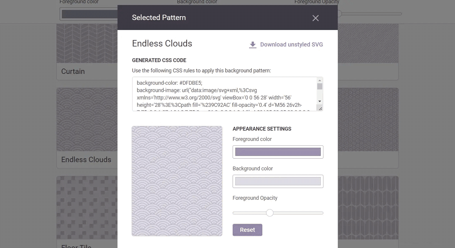
从上述演示中可以看到,背景采用了SVG云纹效果。其实现方式并不复杂,这里使用了一个专门生成SVG背景的网站。该网站提供多种可定制颜色的SVG背景,用户只需选择喜欢的样式,复制生成的CSS代码即可直接应用。
拉杆绘制
<div class="submit-btn">
    <div class="btn-ball"></div>
    <div class="btn-rod"></div>
    <div class="btn-stand"></div>
</div>
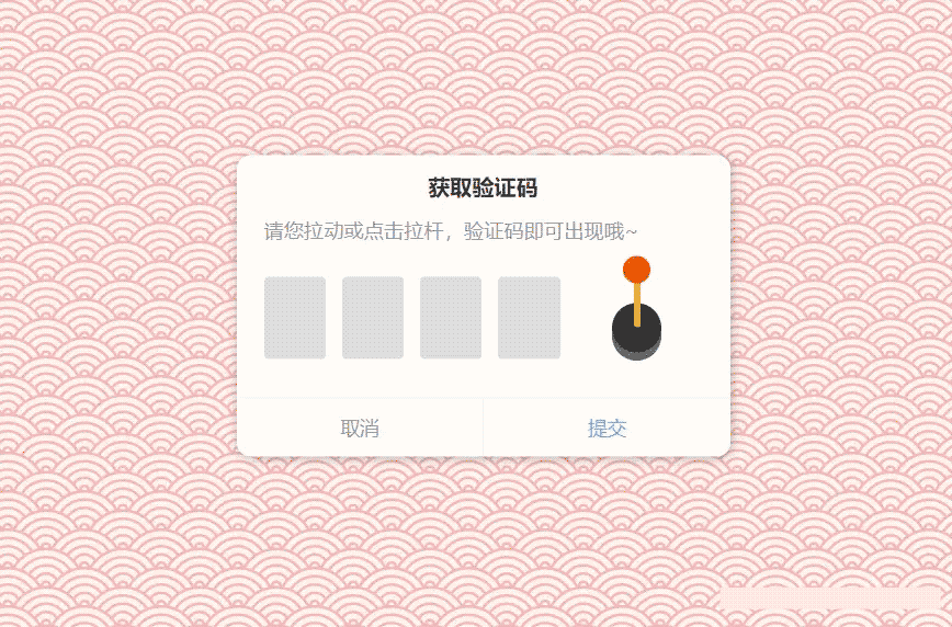
拉杆组件主要由头部、杆体和底座三部分构成。当触发相关事件后,需向容器添加 active 类名,随后通过CSS动画控制头部和杆体执行拉动动作。
.submit-btn{
    &.active{
        .btn-rod{
            animation:rod-down .32s linear;
        }
        .btn-ball{
            animation:ball-down .32s linear;
        }
    }
}
@keyframes rod-down{
   0%{
     transform: scaleY(1);
   }
   60%{
     transform: scaleY(0);
   }
   80%{
     transform:scaleY(-.2);
   }
   100%{
     transform:scaleY(1);
   }
}
@keyframes ball-down{
   0%{
     transform: translateY(0);
   }
   60%{
     transform: translateY(40px);
   }
   80%{
     transform: translateY(60px);
   }
   100%{
     transform: translateY(0);
   }
}
事件绑定相对简单,主要判断鼠标的点击、滑动及抬起事件。当检测到的位移变化量大于3px时,向容器赋予 active 样式,从而触发CSS动画。
生成条带
在数字开始转动前,需先生成数字条带。虽然可以直接使用图片,但为了前端自给自足,这里选择使用 canvas 元素拼接生成图片形式的数字条带。
function createBackgroundImage(w, h) {
    let canvas = document.createElement("canvas");
    let ctx = canvas.getContext("2d");
    canvas.width = ctx.width = w;
    canvas.height = ctx.height = h * 10;
    let BackgroundImage = new Array(10).fill(0);
    BackgroundImage.forEach((n, i) => {
        ctx.save();
        ctx.textAlign = "center";
        ctx.textBaseline = "middle";
        ctx.font = "bold 36px Baloo Bhaijaan";
        ctx.fillText(i, w / 2, h * i + h / 2 + 5, w);
        ctx.restore();
    });
    return convertCanvasToImage(canvas);
}
function convertCanvasToImage(canvas) {
    var image = new Image();
    image.src = canvas.toDataURL("image/png");
    return image;
}
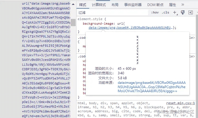
在项目初始化阶段,该方法会被执行。利用 canvas 绘制出0到9共十个数字并纵向排列,最后通过 toDataURL 方法导出为图片,并将其设置为需要转动区域的背景图。
数字转动
既然背景图已生成,实现转动效果的关键在于改变 backgroundPositionY 的值。此外,为了让动画呈现先加速后减速停止的效果,需要引入缓动处理。此处推荐使用一个轻量且灵活的动画库 animejs。
import anime from "https://cdn.skypack.dev/animejs@3.2.1";
function play() {
    let nums = createNums();
    code = nums.join("");
    [].forEach.call(list.children, (el, index) => {
        setTimeout(() => {
            let y = parseInt(el.style.backgroundPositionY || "0", 10);
            anime({
                targets: el,
                backgroundPositionY: [y, y + h * 30 + (10 - nums[index]) * h],
                loop: false, // 循环播放
                direction: "normal",
                easing: "easeOutCirc", // 时间曲线
                duration: 2000, // 播放时间2s
                autoplay: true, // 是否立即播放
                complete: (anim) => {
                    if (index == 3) isActive = false;
                }
            });
        }, index * 200);
    });
}
function createNums(l = 4) {
    let num = random(1, 9999);
    let res = (num + "").split("");
    let len = res.length;
    if (len < l) {
        for (let i = 0; i < l - len; i++) {
            res.unshift("0");
        }
    }
    return res;
}
首先获取验证码,此处以随机数模拟。接着遍历四个转动区域,生成 anime 动画。backgroundPositionY 的最终结果需根据之前获取的验证码数字,计算对应位置。为了提升视觉效果,遍历过程中使用 setTimeout 定时器,每隔200ms依次启动下一个转动块的执行。
以上即为JS SVG获取验证码的玩法示例的详细内容,更多关于JS SVG获取验证码的资料请关注本站其它相关文章!